
The S&P 500 closed green today. Up half a percent. If that's all you saw, you'd assume it was a good day for stocks. But under that green print, more stocks fell than rose, the intraday tape was heavy for six straight hours, and the only reason the index finished up was that five mega-cap names did all the lifting while four hundred others quietly bled. The headline said "up." The market said "narrow, tired, and running on fumes."
That gap — between what the index prints and what the stocks inside it are actually doing — is the entire subject of this guide. It's called market breadth, or market internals, and it is the closest thing trading has to X-ray vision. Price tells you where the market is. Internals tell you how healthy it is getting there. And health, it turns out, leads price. Not always, not on a stopwatch, but often enough and early enough that a trader who reads internals is operating with information the tape-only crowd simply does not have.
This is a long one because it has to be. We're going to build the full toolkit — the advance/decline line, the TICK, TRIN, the McClellan Oscillator, percent-of-stocks-above-moving-averages, new highs versus new lows, and the equal-weight-versus-cap-weight tell. For each one we'll go past the definition into how you actually read it, what it does in different market regimes, how it stacks across timeframes, and the specific mistakes that turn a good tool into a losing habit. Then we'll wire the whole thing into the HPT top-down process so you can use it Monday morning instead of just admiring it. Let's dig under the market.
The Concept: A Market Is a Crowd, Not a Number
Here's the mental shift that makes all of this click. The S&P 500 is not a thing. It's a weighted average of 500 things. When you look at the SPY chart, you're looking at a summary statistic — and like any average, it hides the distribution.
Imagine a classroom of 500 students takes a test and the class average is 82. Sounds like a solid class. But that 82 could come from every student scoring 82, or from 30 kids acing it at 99 and 470 kids scraping by at a bare pass while a few catastrophic failures drag on the mean. Same average. Completely different classroom. If you were the teacher deciding whether to move on to the next chapter, you'd desperately want to see the distribution, not just the mean. The mean tells you almost nothing about who is actually keeping up.
Breadth is the distribution of the market. It answers: when the index moved, how many soldiers marched with it? A rally where 450 of 500 stocks advance is a healthy, broad, believable rally. A rally where the index is green but only 180 stocks advanced is a narrow rally — a handful of generals charging ahead while the army sits in the trenches. Narrow rallies are the ones that reverse, because a market held up by five names has only five names' worth of support, and when those five wobble there's nothing underneath.
Confirmation versus divergence — the one idea behind everything
The core principle that every single internal is built on is confirmation versus divergence:
- Confirmation — internals agree with price. Index makes a new high, and breadth makes a new high alongside it. The move is real. Trust it, press it, trade offense.
- Divergence — internals disagree with price. Index makes a new high, but breadth is lower than it was at the last high. Fewer stocks are participating. The move is hollow. Fade it, or at least stop trusting it and start protecting.
Every tool we cover is just a different lens on that same question: is the crowd behind this move, or is it a few names faking it? The A/D line answers it by counting stocks. The TICK answers it tick by tick in real time. TRIN folds volume into the count. The McClellan measures the momentum of the count. Percent-above-moving-average measures how many stocks are structurally healthy. New highs/new lows measure the extremes. RSP/SPY measures it as a single ratio. Seven instruments, one question. Once you see that, breadth stops being a pile of jargon and becomes a single coherent read.
Why "health leads price"
There's a mechanical reason internals lead. A cap-weighted index can be levitated by money crowding into a shrinking number of leaders long after the broad market has topped. Institutions rotate out of the average stock first — they sell the small and mid caps, the cyclicals, the second-tier names — and park the proceeds in the biggest, most liquid megacaps because those are the last things you can sell in size without moving the price. So the tape you see is the index holding up on megacap strength while the median stock is already rolling over. The A/D line and the percent-above-50-day catch that rotation in real time. By the time the megacaps themselves finally give way and the index price cracks, the internals have been warning for weeks. Health leads price because distribution happens underneath the average before it shows up in the average.
The Advance/Decline Line: The Foundation
Start here, because everything else is a variation on this idea. The advance/decline line (A/D line) is a running total of market breadth. Each day you take the number of stocks that went up (advancers) and subtract the number that went down (decliners). That day's net number — say +1,200 or –800 — gets added to a running cumulative total. Plot that total over time and you get a line.
The A/D line's level is meaningless — it's cumulative, so it can be any number depending on when your data series started. What matters is its direction and its agreement with the index. You are never reading the number; you are reading the slope and comparing its peaks and troughs to price's peaks and troughs.
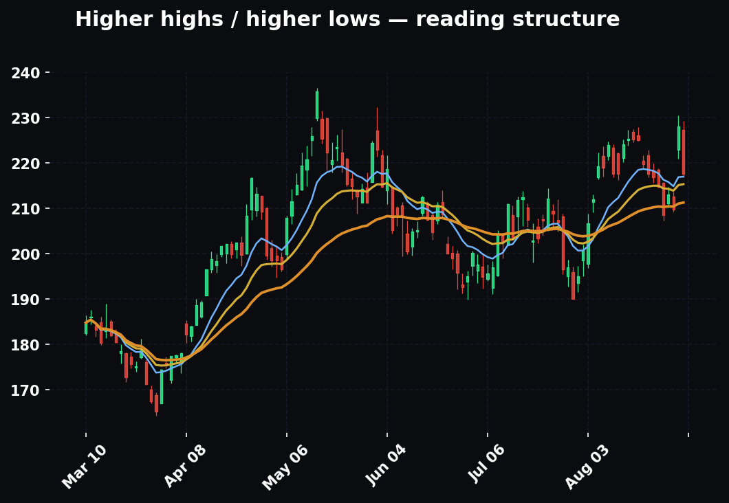
- Index up, A/D line up → healthy, broad advance. The rally has legs.
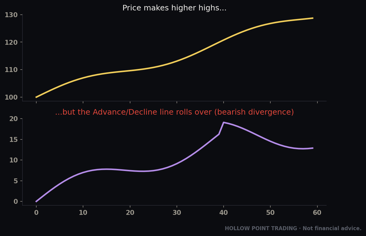
- Index up, A/D line flat or down → bearish divergence. The index is being carried by a shrinking group of leaders. This is the single most reliable early-warning signal in all of market internals. Major market tops are almost always preceded by the A/D line rolling over weeks or months before the index does.
- Index down, A/D line holding or rising → bullish divergence. The selling is concentrated in a few heavy names while the broad market quietly firms. This is how durable bottoms build.
Why the A/D line sees what the index can't
The mechanism is simple and it's about market-cap weighting. The S&P 500 is cap-weighted, meaning a $3-trillion company moves it far more than a $30-billion one. So a handful of giant stocks can push the index to new highs even while the median stock is in a downtrend. The A/D line, by contrast, counts every stock equally — the biggest name in the index and the smallest each get one vote. That's exactly why it catches the rot the index hides. The index is a rich man's average; the A/D line is one-share-one-vote democracy. When the two disagree, the democracy is usually right about where things are headed.
Which A/D line to watch
Not all A/D lines are equal, and this trips people up. The NYSE Composite A/D line is the classic, and it's historically the most reliable for major tops — but be aware it includes a lot of non-operating-company issues (closed-end funds, preferreds, interest-rate-sensitive vehicles) that can distort it. The S&P 500 A/D line and the common-stock-only NYSE A/D line are cleaner reads on actual corporate equity. For most HPT work, watch the S&P 500 A/D line for your core index read and cross-check the broad NYSE line. If they disagree, the narrower, cleaner series usually reflects what real stocks are doing.
Worked example — the classic top. The index grinds to a fresh all-time high in, say, week 10. You pull up the A/D line and notice its peak was back in week 4, and it's been making lower highs ever since even as price made higher highs. That's the tell. The generals are still marching; the army turned around a month ago. You don't short on the divergence alone — divergences can persist longer than you can stay solvent — but you tighten stops, stop buying breakouts, and get suspicious of every new high. When price finally cracks its EMA 55 on the daily, you already knew why, and you were positioned defensively before the first ugly candle instead of after it.
Worked example — the bullish version at a bottom. Bear market, everyone's miserable. The index makes a marginal new low in October, undercutting the September low by a few points. But you check the A/D line and it made a higher low — fewer stocks participated in the new price low than in the last one. The selling has narrowed to a few heavy names; the broad market has stopped going down. That's not a reason to back up the truck by itself, but it's the first brick in a bottom. You start watching for a McClellan thrust and a percent-above-50-day turn to confirm it, and you stop pressing shorts.
The A/D volume line — following the money
There's a cousin worth knowing: the advance/decline volume line, which sums up-volume minus down-volume instead of counting names. It answers a slightly different question — not "how many stocks rose" but "where did the money flow." When the two disagree — lots of advancers but volume flowing into decliners — you've got churning under the surface: a market where the count looks fine but the dollars are quietly leaving. On a day where the plain A/D is +900 but the A/D volume line is negative, be skeptical of the up-day; the money vote outranks the headcount vote.
The TICK: The Market's Heartbeat, Beat by Beat
The A/D line is a daily, big-picture tool. The NYSE TICK is its intraday cousin — a real-time pulse you read second by second.
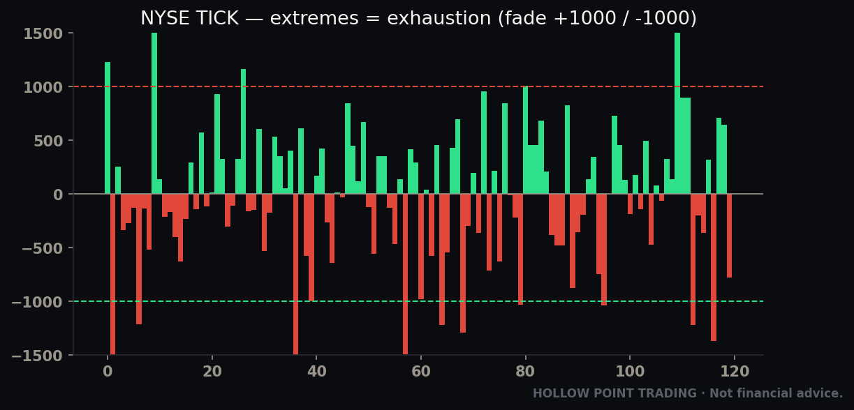
The TICK measures, at any given instant, the number of NYSE stocks trading on an uptick (last trade higher than the previous) minus the number trading on a downtick. It ranges roughly from –1,500 to +1,500, and it whips around constantly. Think of it as the market's heartbeat monitor. You don't read any single beat — you read the pattern of beats.
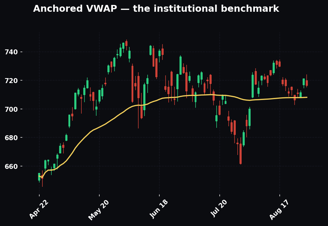
The three ways to read TICK
1. Extreme readings = exhaustion, not strength. This is counterintuitive and it's the whole game. A TICK spike to +1,200 means nearly every stock is ticking up at the same instant — that's not the start of a move, it's a climax. Everyone who was going to buy just bought. Extreme readings above +1,000 or below –1,000 mark short-term exhaustion points, and price often reverses shortly after. Fade the extreme, don't chase it. The old floor saying: "buy weak TICK, sell strong TICK."
2. The zero line is a bias line. When the TICK spends the day mostly above zero — repeatedly pushing to +800/+1,000 and only pulling back to –200 — buyers are in control all session. When it lives below zero, sellers own the tape. This is your intraday conviction gauge. A market that can't get the TICK above +500 all morning is a weak market, no matter what the index candle looks like. Draw the imaginary line: where is the TICK centered? A tape centered at +300 with occasional +1,000 spikes is a completely different animal from one centered at –100 that pokes above zero and immediately falls back.
3. Divergence with price, intraday. Same principle as the A/D line, faster clock. If SPY makes a new intraday low but the TICK makes a higher low (less selling pressure than the prior flush), the down-move is losing fuel. That's your heads-up for a bounce.
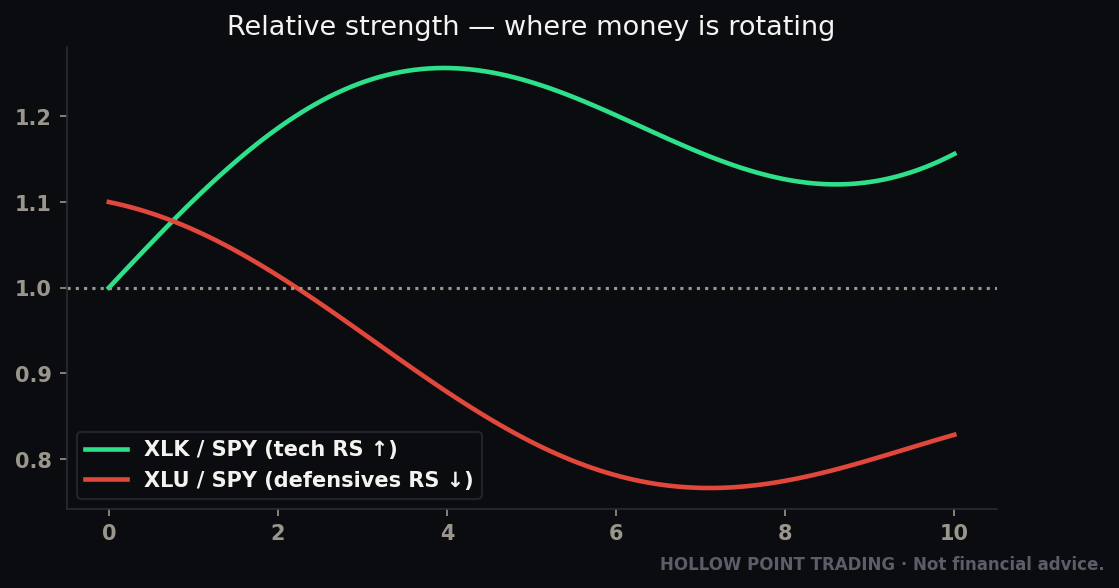
Reading TICK by regime — this matters enormously
The single biggest TICK mistake is using the same thresholds in every kind of tape. The levels that mean "extreme" shift with the regime:
- Trending up (strong trend day): In a powerful bull trend day, the TICK will pin above zero and print repeated +1,000s that do not reverse. This is the exception to the fade rule. When the FIRST hour prints +1,200 and price keeps grinding higher, that's not exhaustion — it's a signature of a broad-participation trend day, and you trade with it, buying pullbacks that hold above the rising VWAP. The tell that it's a trend day and not a fade: the pullbacks in TICK only reach –200 or –300, never a real flush to –800. Shallow downside TICK = held bid = trend day.
- Chop / range day: Here the fade rules work best. TICK +1,000 at the top of the range and TICK –1,000 at the bottom are your reversal signals. The range persists precisely because every push exhausts and reverses. This is the environment the "buy weak, sell strong" saying was built for.
- High-volatility / news day: TICK extremes stretch. On a panic day you'll see –1,400 prints that would be climactic on a normal day but are just Tuesday in a crash. Recalibrate: in high vol, wait for the TICK extremes to start contracting — a –1,400 followed by a –1,100 followed by a –900 on successive flushes — before you trust a bottom. Absolute levels lie in high vol; the sequence tells the truth.
Worked example — the failed breakout. Price is pushing to new highs of the day at 11:00 a.m. You glance at the TICK: it's only hitting +400 on these new highs, whereas an hour ago the pushes were hitting +900. Fewer stocks are participating in the new high than before. The breakout is thinning out. If you were long, this is where you trail your stop tight; if you were looking to fade, the TICK just handed you a reason. Ten minutes later price rolls over — you were early, but you were early on purpose.
Worked example — separating a trend day from a fade. 9:45 a.m., the market gaps up and the TICK immediately prints +1,050. Beginner instinct: "extreme, fade it." But watch what happens on the first pullback — TICK only dips to –150 and price barely ticks down before pushing again to +1,100. That refusal to flush is the trend-day fingerprint. The correct read is not to fade; it's to wait for the shallow pullback and go long. Compare that to a chop day where the +1,050 is followed by a –700 flush and price gives back the whole pop — there, the fade was right. Same +1,050 print, opposite trade, and the pullback depth is what told you which world you were in.
TIKI — the megacap sibling
Pair the TICK with its sibling TIKI (the Dow 30 version) for a faster, narrower read on the mega-caps specifically. When TIKI is ripping but broad TICK is soft, the big names are moving without the crowd — narrowness again, on an intraday clock. TIKI ranges roughly –30 to +30 (there are only 30 Dow names), and a TIKI locked at +25/+28 while the broad TICK can't clear +400 is the intraday version of the whole "megacaps carrying a hollow tape" story. It's a fast, clean tell for "this rip is just the giants."
TRIN (The Arms Index): Pressure Versus Participation
The TRIN, or Arms Index (after Richard Arms who created it in 1967), is the internal that trips people up most, so we'll go slow. It combines breadth and volume into one ratio, and — critical — it moves inverse to the market. High TRIN is bearish-looking but often bullish for a bounce; low TRIN is the reverse. Read that sentence twice.
The formula:
TRIN = (Advancers / Decliners) ÷ (Advancing Volume / Declining Volume)
Ignore the algebra and understand what it measures: it compares the ratio of rising-to-falling stocks against the ratio of rising-to-falling volume. It asks whether volume is flowing into stocks in proportion to how many are rising.
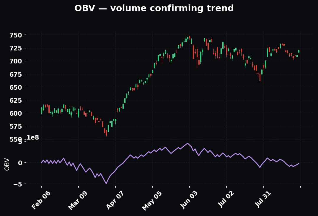
What the levels mean
- TRIN = 1.0 — breadth and volume are balanced. Neutral.
- TRIN below 1.0 — volume is concentrating into advancing stocks more than the raw count suggests. Money is aggressively chasing winners. Bullish tape.
- TRIN above 1.0 — volume is piling into decliners. Selling has conviction. Bearish tape.
Why the inversion happens
The inversion confuses people until they see the mechanism. When the market is getting hammered, volume floods into the declining stocks — panicked selling is high-volume by nature. That pushes the denominator (advancing volume / declining volume) very low, which makes the whole ratio very high. So a high TRIN literally measures the intensity of the dumping. And intense, all-at-once dumping is exactly what marks capitulation bottoms. The number is high, the tape looks awful, and that's precisely why the bounce is near. Conversely, a euphoric buying climax jams volume into advancers, drives the ratio very low, and marks the kind of one-sided greed that precedes pullbacks. The TRIN isn't backwards — it's measuring intensity, and intensity peaks at turning points.
The reversal-signal use
Now the use where TRIN earns its keep. Extreme high TRIN readings (2.0+, sometimes spiking to 3.0 on panic days) signal capitulation selling — everyone's dumping at once, volume is gushing into decliners, and that kind of washout typically marks a short-term bottom. Extreme low readings (below 0.50) signal a buying climax and often precede a pullback. Same exhaustion logic as the TICK: the extreme is the end of the move, not the middle.
Worked example — the capitulation flush. Ugly morning. Index gapping down, red across the board. You check TRIN: it's sitting at 2.4. That's not "sell more" — that's washout in progress. Every seller is hitting the bid at once. Rather than short into a 2.4 TRIN, you flip your posture: watch for the TICK to stop making lower lows, watch for a reversal candle at a level, and prepare for the snap-back. Panic prints the best long entries, and TRIN is how you measure the panic.
Closing TRIN and the multi-day read
There's a subtler use most people miss. A closing TRIN — the reading at the bell — carries information about the next session. A close above roughly 2.0 (a genuinely washed-out finish) has historically been followed more often than not by a bounce the next day. A string of low closing TRINs day after day (0.6, 0.7, 0.5) during a rally is a sign of persistent, healthy demand — but a single very low close after an extended run can mark a blow-off. And a 10-day moving average of TRIN smooths the noise into an intermediate overbought/oversold gauge: above about 1.2 on the 10-day average is broadly oversold territory; below about 0.85 is broadly overbought. This turns a jumpy intraday number into a usable swing-timing tool.
One caution: intraday TRIN is jumpy in the first few minutes when volume data is thin. Give it 15–20 minutes to settle before you trust the reading. And be aware that on a very low-volume holiday-adjacent session the ratio distorts easily — thin volume makes the denominator unstable.
The McClellan Oscillator: Breadth Momentum
If the A/D line is the position of breadth, the McClellan Oscillator is its momentum — the acceleration and deceleration underneath.
Mechanically it's the difference between a 19-day and a 39-day exponential moving average of daily net advances (advancers minus decliners). You don't need to compute it — every platform has it — you need to read it. It oscillates around a zero line, typically between about –100 and +100, with –150 to +150 marking the extremes.
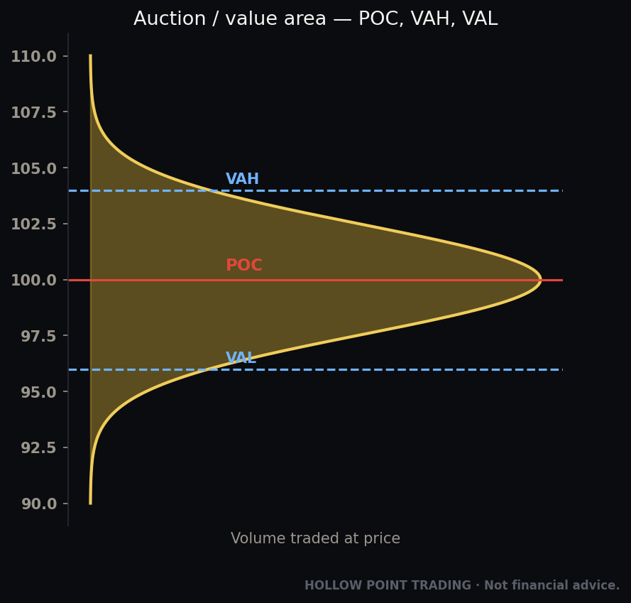
How to read it
- Above zero — breadth momentum is positive; more stocks accelerating up than down.
- Below zero — breadth momentum is negative.
- Zero-line crosses — a cross from below to above zero is an early signal that a breadth thrust is beginning; the reverse warns of deterioration.
- Extremes — readings above +100 flag an overbought, often-exhausted advance; below –100 flags an oversold, often-washed-out decline ripe for a bounce.
- Divergences — the oscillator making lower highs while the index makes higher highs is the same top-warning as the A/D line, expressed as momentum.
The breadth thrust — the McClellan's best signal
The best use is the breadth thrust: when the oscillator rockets from deeply oversold (say –150) up through zero and keeps going, it signals a violent shift from broad selling to broad buying — the kind of participation surge that launches durable rallies off major lows. A single stock can't fake that; it requires the whole crowd to turn at once. When you see a McClellan go from –140 to +90 in a handful of sessions, you're watching the entire market change direction underneath the price, and those thrusts have historically preceded the strongest, most durable rallies. This is the internal signature of "the bottom is in" — not a guarantee, but the kind of broad, forceful participation shift that bottoms are made of.
There's a related classic, the Zweig Breadth Thrust, which uses a 10-day average of the advancing-issues ratio going from below 40% to above 61.5% within ten trading days. It's rare — it fires only a handful of times a decade — but its record for marking the launch of major bull moves is remarkable. When one triggers, it's worth knowing.
The Summation Index — the long-term partner
There's a longer-term partner, the McClellan Summation Index, which is the cumulative running total of the oscillator — effectively the "A/D line" of McClellan. Use it for the multi-week trend of breadth: rising Summation = broad bull phase; rolling over = the tide going out. Where the oscillator is your daily and swing momentum read, the Summation is your position-trader's regime gauge — is the intermediate breadth trend up or down? A Summation Index that crosses from negative to positive after a bottom confirms that a breadth thrust wasn't a one-day head-fake but the start of a genuine broad advance.
Percent of Stocks Above the 50 and 200-Day
This one is beautifully intuitive. What percentage of stocks in an index are trading above their own 50-day moving average? Above their 200-day?
The 50-day version (ticker $S5FI or similar for the S&P) is your intermediate-term participation gauge. The 200-day version ($S5TH) is the long-term / bull-bear line.
Reading the gauges
Read them as oscillators between 0 and 100%:
- Above 80% — broadly overbought. Most stocks are extended above their average. Not an instant sell, but the easy money's been made and pullback risk is rising.
- Below 20% — broadly oversold. Most stocks are beaten down. Historically these are where durable bottoms form (not necessarily the exact low, but the zone).
- The 50% line on the 200-day is the big one: above 50% of stocks over their 200-day = a bull-market internal structure; below 50% and falling = the majority of stocks are in long-term downtrends regardless of what the cap-weighted index says.
The layered read — combining the two horizons
The real power comes from reading the 50-day and 200-day versions together, because they describe different time horizons and their relationship tells a story:
- Both high (50-day >80%, 200-day >70%): Broad, mature bull. Great for having been long; getting late for new aggressive entries. Overbought but structurally strong — pullbacks are buyable, not the start of a bear.
- 50-day low, 200-day high (say 50-day at 25%, 200-day at 65%): A pullback within an intact bull. The intermediate term is washed out but the long-term structure is fine. This is the classic "buy the dip" internal signature — the correction is real but the primary trend is alive.
- 50-day recovering, 200-day still low (50-day 55%, 200-day 30%): Early recovery off a bear-market bottom. The bounce is real (50-day rising) but the long-term structure hasn't healed yet. Trade it as a rally in a still-suspect market — take profits, don't marry positions.
- Both low and falling: Genuine bear market. The majority of stocks are below both averages. Rallies are for selling until the structure repairs.
The divergence use is gold
Index makes a new high, but the percent-above-50-day makes a lower high — fewer stocks are participating in the new high than in the last one. Textbook narrowing. Combine it with the A/D line and you've got two independent confirmations of the same rot.
Worked example — the narrow melt-up. The index prints new highs for three weeks straight. Feels unstoppable. But percent-above-50-day peaked at 78% on the first high and is now at 61% on the latest one — each new index high is being made by fewer stocks. Meanwhile percent-above-200-day is holding at 64%, so the long-term structure is intact but the intermediate thrust is thinning. Translation: the trend isn't dead, but it's getting top-heavy and led by fewer names. You keep your core longs, stop adding, and demand better setups. Six weeks later the index finally has its 5% correction — and the percent-above-50-day, which had already fallen to the mid-50s, drops to 30% while the 200-day version barely dents, confirming it was a dip and not a top. You buy that dip with confidence because the internals told you the structure never broke.
New Highs vs New Lows: The Quality of a Trend
Every day, some stocks make a new 52-week high and some make a new 52-week low. The net new highs figure (new highs minus new lows) is a purity test for a trend.
In a genuinely healthy bull market, new highs vastly outnumber new lows — the leadership is broad and expanding. The warning sign is expanding new lows during an index uptrend. When the index is still climbing but the new-lows list is quietly growing — 40 names, then 70, then 120 hitting fresh 52-week lows while the index is near its high — you have serious internal decay. Something is breaking under the surface even as the headline holds.
The subtle top signal — new highs contracting
There's a quieter version that precedes the new-lows expansion. Watch the new highs count at successive index peaks. Index peak #1: 320 new highs. Index peak #2 (higher price): 210 new highs. Index peak #3 (higher still): 140 new highs. Price is making higher highs; the number of stocks achieving new highs is shrinking each time. That contraction in new highs is often the earliest of all the breadth top signals — it shows up before the A/D line even clearly rolls, because it's measuring the leadership's ability to keep making fresh highs, which fails first.
The Hindenburg Omen and split markets
The nastiest version is the Hindenburg Omen setup, where you get an unusual number of both new highs and new lows simultaneously — a market so split it's pulling apart at the seams. The technical definition layers a few conditions (both new highs and new lows exceeding a threshold like 2.8% of issues on the same day, with the index still above its 50-day and a negative McClellan), but you don't need to trade the Omen mechanically — its record is spotty and it produces false alarms. What matters is the underlying condition: a market where lots of stocks are hitting highs and lots are hitting lows at the same time is a fractured, incoherent tape. Half the market is in one bull and half is in a private bear. Healthy markets are coherent — the vast majority of names move roughly together. Splitting markets, where highs and lows both expand, are fragile and prone to air-pockets. Treat the condition as a caution flag that raises your defensiveness, not a mechanical short trigger.
Equal-Weight vs Cap-Weight: The RSP/SPY Tell
This is the cleanest, most elegant breadth signal on the board, and you can watch it as a single line chart. SPY is the cap-weighted S&P 500 — dominated by the mega-caps. RSP is the equal-weight S&P 500 — the exact same 500 stocks, but each holds the same ~0.2% weight, so the median stock matters as much as the giant.
Plot the RSP/SPY ratio (or just overlay the two normalized from the same start date).
- Ratio rising — equal-weight is outperforming cap-weight, meaning the average stock is doing better than the giants. Broad, healthy participation. This is what you want to see in a durable bull.
- Ratio falling — cap-weight is winning, meaning a few mega-caps are outrunning everything else. Narrow leadership. The rally is getting concentrated.
You don't even need the A/D line to spot narrowness — a falling RSP/SPY ratio during a rising SPY tells you instantly that the index gains are top-heavy. When the whole market's advance depends on five names, this ratio is bleeding lower the entire time, in plain sight.
The two cousins — QQQE/QQQ and sector versions
The same trick works anywhere there's an equal-weight version. QQQE/QQQ does it for the Nasdaq 100 — a falling ratio means the Qs are being carried by their handful of biggest names. Sector SPDRs have equal-weight cousins too (like RSPT for tech). When you want to know "is this sector rally broad or just its two giants," pull the equal-weight-over-cap-weight ratio for that sector. It's the same one-glance narrowness test applied at any level of the funnel.
The turn is the signal
The most valuable moment on the RSP/SPY chart is not the trend but the turn. A ratio that has fallen for months (narrow, megacap-led market) and then bottoms and starts rising signals a broadening — money rotating out of the crowded giants and into the average stock. That broadening is a classic mid-bull continuation signal: the rally isn't dying, it's widening, which is healthier and more durable than the narrow phase that preceded it. Conversely, a long-rising ratio that rolls over warns that a broad market is narrowing into a few leaders — the beginning of the top-heavy phase.
Worked example. SPY is up 8% over two months and everyone's bullish. You pull RSP/SPY and it's been falling the whole time — the equal-weight index is up only 2%. That 8% is almost entirely a handful of trillion-dollar names. The "market" isn't strong; seven stocks are strong. That reframes every decision: you stop assuming rising-tide-lifts-all-boats, and you get selective, because most boats aren't rising. Then, a month later, RSP/SPY bottoms and turns up while SPY consolidates sideways — the laggards start catching a bid. That's your cue that the bull is broadening, and suddenly the second-tier setups you'd been ignoring start working. You rotate from "own only the leaders" to "the whole field is playable."
Putting the Instruments on One Dashboard
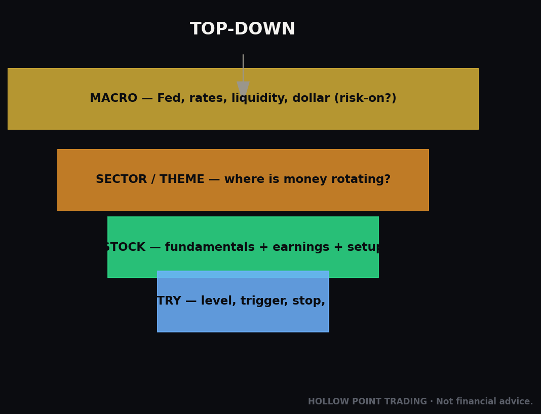
Individually each internal is a lens. Together they form a panel you read top to bottom in about thirty seconds before the open. The skill isn't any single tool — it's reading them as a chord and hearing whether they harmonize or clash.
Here's the pre-market scan, in order:
- A/D line (daily): confirming price or diverging? Sets the structural bias.
- Percent above 200-day: above or below 50%? Bull or bear structure.
- Percent above 50-day: overbought (>80), oversold (<20), or mid-range? Intermediate pressure.
- RSP/SPY: rising or falling? Broad or narrow.
- McClellan Oscillator: above/below zero, extreme, diverging? Momentum of breadth.
- New highs vs new lows: expanding highs (healthy) or expanding lows (decay)?
When five or six of these point the same way, you have aligned internals — high conviction, trade offense or defense accordingly. When they split — A/D confirming but McClellan diverging and new lows creeping up — you have mixed internals, which is itself a signal: lower your conviction and your size. Mixed is not "ignore it"; mixed is the read.
Multi-Timeframe Breadth: The Fractal
Breadth is fractal — it works on every clock, and the HPT principle of timeframe-weighted confluence applies directly. The higher timeframe owns the bias; the lower timeframe owns the timing.
- Position/structural (weeks–months): Percent above 200-day, McClellan Summation Index, the long-term A/D line trend, RSP/SPY trend. These define what kind of market you're in — bull structure or bear structure — and change slowly.
- Swing (days–weeks): McClellan Oscillator, percent above 50-day, the A/D line's recent peaks and troughs, net new highs. These time the intermediate turns within the structure.
- Intraday (minutes–hours): TICK, TIKI, TRIN, intraday cumulative A/D and up/down volume. These gate your executions inside the day.
The rule when timeframes conflict: the higher timeframe wins the bias, the lower times the entry. If the structural internals say bull (percent-above-200-day at 68%, Summation rising) but the intraday TICK is soft and TRIN is at 1.5 this morning, you don't flip bearish — you just recognize it's a weak session inside a strong market, so you wait for a better intraday entry rather than chasing. Conversely, a screaming +1,100 TICK on a single morning does not override a percent-above-200-day that's been below 40% and falling for two months — that's a bear-market rally, and you fade strength rather than trusting it. Conflicts aren't contradictions; they're the two clocks telling you bias from above, entry from below.
Breadth Across Market Regimes
The same reading means different things in different weather. This is the difference between someone who memorized the rules and someone who trades them.
Trending market
In a strong, broad uptrend, internals confirm and stay confirmed — the A/D line makes new highs with price, percent-above-50-day holds in the 60–80 band, McClellan oscillates above zero, RSP/SPY rises or holds. In this regime the extreme readings are less reliable as fade signals (an overbought percent-above-50-day can stay overbought for weeks). The right use of internals here is not to fight the trend but to watch for the first divergence — the first time price makes a higher high and the A/D line doesn't. That's your early warning that the trend regime is aging.
Choppy / range-bound market
In chop, the mean-reversion signals shine. TICK and TRIN extremes reliably mark the edges of the range; percent-above-50-day swinging between 30 and 70 without trending tells you there's no directional conviction. Here you fade the extremes and distrust the breakouts — a breadth thrust in a choppy tape often fails because there's no structural trend to feed it. The A/D line going sideways is the chop, drawn out.
High-volatility / crisis market
Everything stretches and speeds up. TRIN spikes to 3+ that would be once-a-year events in calm markets happen weekly. TICK prints –1,400 routinely. The absolute thresholds all become unreliable; what you read instead is the sequence and the divergence. Bottoms in high vol are built on a series of contracting extremes — each panic flush less severe than the last — plus a McClellan that stops making lower lows even as price does. The most reliable high-vol signal is the breadth thrust off the low: when the McClellan explodes up through zero after a capitulation, that violent broad turn is the internal fingerprint of a tradable bottom. Patience is the edge here; the market that's stretching internals to record extremes is not one to pick tops and bottoms in casually.
Confluence: Wiring Breadth Into the Rest of the Toolkit
Internals are a conviction layer. They're most powerful when they line up with price structure and other tools. Three high-value combinations:
Breadth + EMA 12/22/55 structure
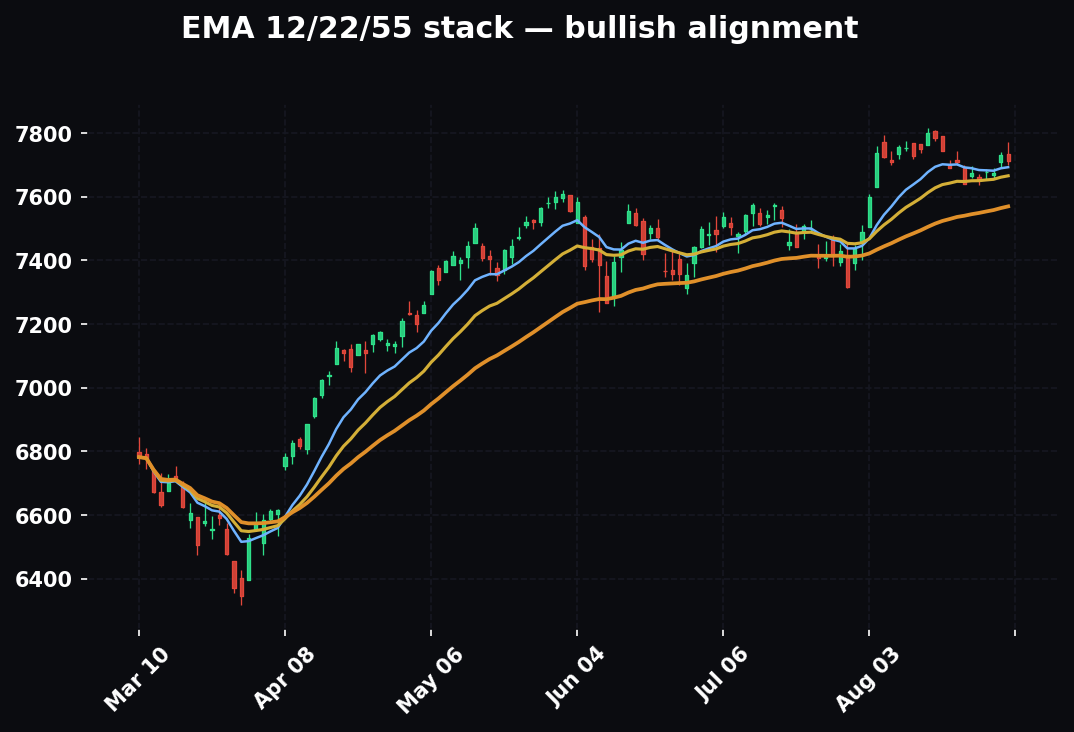
The HPT trend framework defines direction with the 12/22/55 EMA stack; internals tell you whether the market behind that stock supports the trade. A long setup where the stock's daily EMAs are stacked bullish (12 over 22 over 55, all rising) is a good trade — but it's an A+ trade when the market's A/D line is confirming and percent-above-200-day is above 50, and a marginal trade when the internals are diverging. Same chart, same setup, but the internals move it from "half size, wait for the retest" to "full size, take the breakout." The EMA stack answers "is this stock trending?"; breadth answers "is the tide with me?"
Breadth + support/resistance + reversal candles
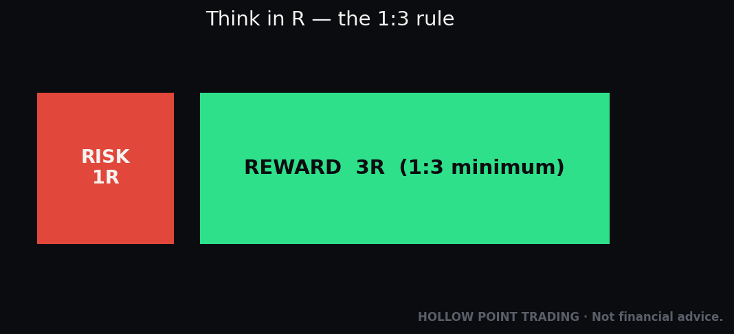
Internals turn a good level into a great entry. Say price is falling into a major daily support shelf and you're looking for a long. On its own, the level is a coin-flip. Now add internals: TRIN spiking to 2.3, TICK printing a higher low as price makes a lower low, and a hammer forming right on the shelf. Three independent confirmations — the level (structure), the reversal candle (price action), and the capitulation internals (breadth) — converge on the same spot. That's an entry, and your stop goes just under the shelf for a clean 1:3. The internals didn't create the setup; they graded it up from "maybe" to "press it."
Breadth + the golden pocket / Fib retracement
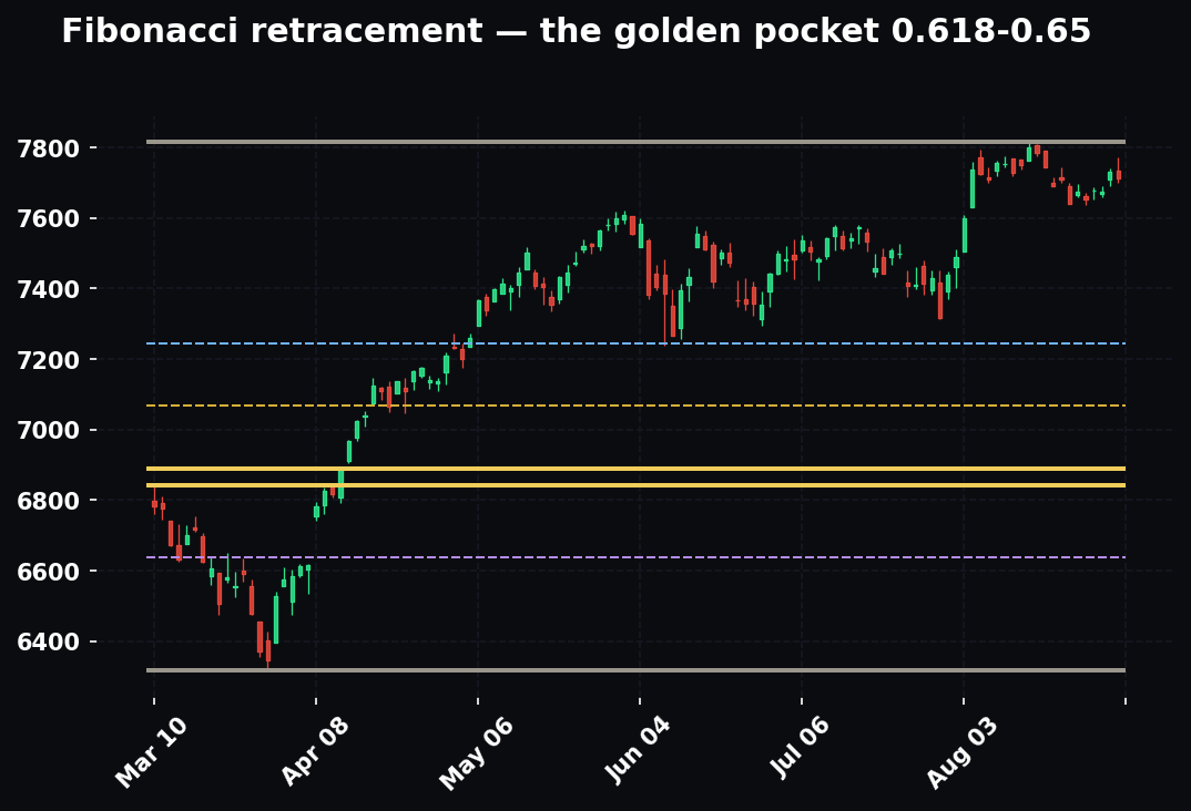
When price pulls back into the 0.618–0.65 golden pocket of a prior up-leg, that's a classic HPT long zone. Overlay breadth: is the pullback a healthy dip (percent-above-50-day washed to the 30s while percent-above-200-day holds, A/D line making a higher low) or the start of something worse (percent-above-200-day breaking below 50, new lows expanding)? Healthy-dip internals at the golden pocket = high-conviction reclaim long. Deteriorating internals at the same Fib level = a knife you don't catch. The Fib gives you the where; breadth gives you the whether.
How the Pros Use It Differently From Beginners
The gap between a beginner and a professional isn't which internals they know — it's how they hold them.
Beginners treat internals as signals; pros treat them as conditions. A beginner sees a bearish A/D divergence and shorts. A pro sees the same divergence and lowers their aggression — stops buying breakouts, tightens stops, demands better setups — while waiting for price to confirm before acting. The divergence changes their posture, not their position.
Beginners use fixed thresholds; pros read context. A beginner shorts every +1,000 TICK. A pro asks "trend day or chop day?" first, and knows the +1,000 on a broad trend day is a buy-the-dip signal, not a fade. Same number, opposite trade, decided by regime.
Beginners want one internal to be right; pros read the chord. A beginner finds the one indicator that agrees with their bias and leans on it. A pro reads all six and sizes according to how many agree — full conviction on alignment, half size on a split, flat on a mess.
Beginners react to the current print; pros track the sequence. A pro isn't watching where the McClellan is — they're watching where it's been over the last five sessions and where it's headed. The direction and the divergence carry the information; the level is almost noise.
Beginners size the same every trade; pros let internals set size. This is the whole payoff. The professional's position size is a function of internal conviction. Aligned bullish internals plus a clean setup = full size. Diverging internals plus the same setup = a third of the size, or a pass. Internals don't just tell the pro what to trade — they tell them how much, which is where the real risk management lives.
Beginners forget breadth exists once they're in a trade; pros use it to manage. After entry, the intraday internals become the pro's real-time thesis check. Long a breakout and the TICK rolls under zero while TRIN climbs through 1.4? The tape stopped supporting the trade — the pro tightens or exits, they don't hope. Internals are as much an exit and management tool as an entry tool.
FAQ
Do I need a paid data feed to see internals? For the daily tools — A/D line, percent-above-moving-averages, McClellan, new highs/lows, RSP/SPY — free charting platforms carry the symbols ($ADD, $S5FI, $S5TH, RSP, SPY, and the McClellan on most platforms). Real-time TICK and TRIN sometimes require a live exchange feed; delayed versions still show the daily pattern but lose their intraday edge. For serious intraday use, a real-time TICK/TRIN feed is worth the cost.
Which single internal should I learn first? The A/D line, no contest. It's the foundation, it's free, it's simple, and its top-warning divergences are the highest-value signal in the whole toolkit. Master it, then add the RSP/SPY ratio (also dead simple) for the narrowness read. Those two alone put you ahead of most traders.
How early does the A/D line warn before a top? It varies wildly — sometimes weeks, occasionally months, and in sharp momentum-driven blowoffs sometimes barely at all. That's exactly why it's a condition and not a trigger: it tells you a top is building, not when it arrives. You wait for price to confirm. Never short on the divergence alone.
Can internals stay diverging for a long time? Yes, and this is the number-one way traders lose money with breadth. Divergences can persist far longer than seems reasonable. The market can be "internally weak" and still grind higher for months. Use the divergence to manage risk and lower aggression, never as a standalone short signal.
Is TRIN really inverted, or do I have it backwards? It's genuinely inverted. High TRIN (2+) = heavy selling = often a bounce coming. Low TRIN (<0.5) = euphoric buying = often a pullback coming. The number measures the intensity of one-sided volume, and intensity peaks at reversals. If it feels backwards, you're understanding it correctly.
What's the difference between the McClellan Oscillator and the Summation Index? The Oscillator is short-term breadth momentum (days to weeks); the Summation Index is its cumulative running total, a long-term breadth trend (weeks to months). Oscillator for swing timing, Summation for regime.
Do internals work for futures / a single index like NQ? The internals we've covered describe the broad market (NYSE, S&P 500). For an NQ trader, they're context — the health of the Nasdaq 100's components (via QQQE/QQQ and Nasdaq breadth) directly informs whether an NQ move is broad or a megacap fake-out. You trade the future, but you read the breadth of the basket underneath it.
Should breadth ever override my price levels? No. Breadth sets conviction and posture; price structure and your EMA/level framework time entries and set stops. When they conflict, respect the price stop — a diverging internal doesn't keep you in a losing trade, and a bullish internal doesn't justify holding through a broken level.
The Common Mistakes
1. Treating internals as a timing trigger. Divergences are conditions, not signals. The A/D line can diverge for months before price cracks. If you short every breadth divergence you'll get run over. Internals tell you the quality of a move and set your posture; your price levels and EMA structure still time the entry. Never enter on a divergence alone.
2. Chasing TICK/TRIN extremes instead of fading them. The rookie sees +1,200 TICK and thinks "so much buying, get long!" That's backwards in a range — the extreme is exhaustion. Strong TICK is where you sell, weak TICK is where you buy. Same for TRIN: a 2.5 is a capitulation to buy into, not a reason to short.
3. Fading extremes on a trend day. The mirror-image error to #2. On a broad trend day, +1,000 TICK prints are the signature of the trend, not a fade. If you reflexively fade every extreme without asking "trend or chop?" you'll spend a powerful trend day shorting into strength and getting stopped repeatedly. The pullback depth tells you which regime you're in — shallow TICK pullbacks (–200) mean trend, deep flushes (–800) mean chop.
4. Reading a single TICK print. One beat means nothing. Read the pattern — where does the TICK spend its time relative to zero, are the extremes getting weaker, is it diverging from price. The heartbeat, not the beat.
5. Forgetting TRIN is inverted. High TRIN looks scary and is often bullish for a bounce; low TRIN looks great and often precedes a drop. If you don't internalize the inversion you'll read every signal backwards and act at exactly the wrong moment.
6. Using intraday TRIN in the first five minutes. Volume data is too thin at the open to trust the ratio. It'll whip to absurd readings that mean nothing. Let it settle 15–20 minutes.
7. Using fixed thresholds across regimes. A TRIN of 1.5 is meaningfully bearish on a calm day and utterly normal noise in a crisis where 3+ is the extreme. Percent-above-50-day at 80% is a warning in chop and a feature of a strong trend. Calibrate your thresholds to the volatility regime, or every number will lie to you.
8. Ignoring the cap-weight trap. Assuming a green SPY means a strong market is the exact error breadth exists to prevent. Always ask: is this the market rising, or a few names? RSP/SPY answers it in one glance. Trading the index headline while the median stock is in a downtrend is how people get blindsided when the megacaps finally roll.
9. Manufacturing confluence. If the internals are mixed — A/D confirming but McClellan diverging — say they're mixed and trade smaller. Don't cherry-pick the one that agrees with your bias. Mixed internals are the signal: lower conviction, less size. Forcing six clashing readings into one clean story is lying to yourself.
10. Watching the wrong A/D line. The broad NYSE Composite line includes closed-end funds, preferreds, and rate-sensitive issues that can distort the read, especially around big interest-rate moves. If your A/D line is diverging but the S&P-500-only, common-stock line is confirming, the distortion may be the culprit. Know which series you're reading.
11. Forgetting breadth once you're in the trade. Internals aren't just an entry tool. After you're long, the intraday TICK/TRIN/AD are your live thesis check. If they turn against you while you're in, that's information — respect it, manage the position, don't tune it out because you already committed.
12. Confusing overbought with a top. Percent-above-50-day at 85% is overbought, but overbought is a feature of strong markets, not a sell signal. Strong tapes stay overbought for weeks. The sell signal isn't the high reading — it's the divergence (price higher high, breadth lower high) or the break (the reading rolling over hard). Overbought alone has bankrupted a lot of premature shorts.
The Cheat-Sheet
Print this. Tape it next to the monitor.
THE PRE-MARKET SCAN (top to bottom, 30 seconds):
- A/D line — confirming or diverging?
- % above 200-day — above/below 50% (bull/bear structure)?
- % above 50-day — overbought >80 / oversold <20 / mid?
- RSP/SPY — rising (broad) or falling (narrow)?
- McClellan — above/below zero, extreme, diverging?
- New highs vs new lows — expanding highs or expanding lows?
BROAD / HEALTHY tape (trade offense, favor breakouts, full size):
- A/D line confirming new highs
- Percent-above-200-day > 50% and rising
- RSP/SPY ratio rising (equal-weight leading)
- McClellan above zero
- New highs >> new lows, new-lows list quiet
- Intraday: TICK lives above zero, pushes +800/+1,000, shallow pullbacks
NARROW / DIVERGING tape (play defense, tighten stops, size down):
- A/D line making lower highs vs price's higher highs
- Percent-above-50-day diverging lower on new index highs
- New highs contracting at each successive index peak
- RSP/SPY ratio falling during a rising SPY
- McClellan below zero or diverging
- New-lows list expanding while index near highs
- Intraday: TICK can't clear +500, spends the day sub-zero
INTRADAY REVERSAL EXTREMES (fade them — in chop, not on trend days):
- TICK +1,000/+1,200 → short-term buying exhaustion, sell strength
- TICK –1,000/–1,200 → short-term selling exhaustion, buy weakness
- TRIN 2.0+ → capitulation selling, look for the bottom
- TRIN below 0.50 → buying climax, look for the pullback
- Percent-above-50-day > 80% → overbought / < 20% → oversold
REGIME ADJUSTMENTS:
- Trend day: don't fade TICK extremes; buy shallow pullbacks with the trend
- Chop day: fade the extremes, distrust breakouts
- High-vol day: thresholds stretch; read the sequence (contracting extremes) and wait for the breadth thrust
MULTI-TIMEFRAME RULE:
- Structural internals (% above 200-day, Summation, RSP/SPY trend) set the bias
- Intraday internals (TICK, TRIN, intraday A/D) time the entry
- On conflict: higher timeframe wins the bias, lower times the entry
BEST SIGNALS BY TOOL:
- A/D line → top-warning divergence (weeks early)
- TICK → intraday exhaustion & bias, price divergence
- TRIN → capitulation bottoms (2+) and buying climaxes (<0.5)
- McClellan → the breadth thrust off a low
- % above 50/200 → dip-vs-top distinction, participation divergence
- New H/L → expanding new lows = decay; contracting new highs = aging top
- RSP/SPY → narrowness at a glance; the turn up = broadening bull
The one-line summary of the whole toolkit:
Price tells you where the market is. Internals tell you how many stocks agree. When they agree, trust the move and press. When they diverge, the move is living on borrowed time — protect capital and wait for the crowd to show its hand.
Master this and you stop being fooled by the headline. You'll see the narrow rally while everyone's celebrating, and you'll see the capitulation bottom while everyone's panicking. That's the edge of looking under the market instead of at it. Read the crowd, not just the number — let the internals grade every setup and set every position size — and your risk will always match reality instead of the headline.
Bound by rules, feared by trade.