
Most retail traders live inside a single ticker. They pull up SPY or their favorite name, draw a trendline, and decide the market is bullish or bearish based on what that one chart is doing. Then they get run over by a move that "came out of nowhere."
It didn't come out of nowhere. It came from the plumbing.
Underneath every equity move sits a machine made of interest rates, the U.S. dollar, credit markets, and commodities. These pieces talk to each other constantly. When you learn to hear that conversation, the stock market stops looking random. You start seeing the setup before the equity chart confirms it — because bonds, the dollar, and credit spreads usually move first.
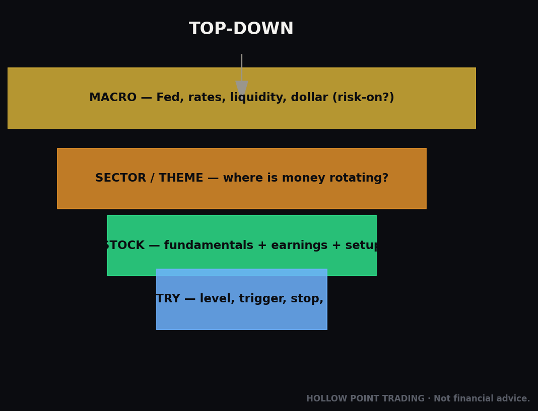
This is intermarket analysis. It's the top of the Hollow Point top-down funnel: macro before sector, sector before stock. Get this layer right and everything below it gets easier. Get it wrong and you'll spend your career reacting to moves that a five-chart glance would have warned you about an hour, a day, or a week early.
Here's the promise, and it's a serious one: nothing in this guide requires an economics degree, a Bloomberg terminal, or a single line of math you can't do in your head. It requires five charts, a clear question, and the patience to let the answer tilt your trades instead of overriding your rules. That's it. By the end of this piece you'll be able to open your platform, spend ninety seconds on the macro layer, and walk into your first stock chart already knowing whether the wind is at your back or in your face.
Let's build it piece by piece — the concept first, then each instrument, then how they chain together, then exactly how to run it inside the HPT process every morning.
The Concept: Everything Is Priced Against Money
Start with one idea and the rest falls into place: every asset on earth is priced against the risk-free rate. The "risk-free rate" is what the U.S. government pays to borrow — Treasury yields. That number is the gravity of all finance.
Why? Because a Treasury bond is the safest yield you can get. If a 10-year Treasury pays you 4.5% for doing nothing risky, then every risky asset — stocks, real estate, crypto, corporate debt — has to offer more than 4.5% to be worth the risk. When the risk-free rate rises, the bar every risky asset must clear rises with it. When it falls, the bar drops and risk assets can float higher.
That single mechanism — the risk-free rate as gravity — is the engine behind almost everything in this guide. Rates up, gravity up, risk assets get heavier. Rates down, gravity down, risk assets get lighter.
Why "gravity" is the right mental model
Gravity is invisible, constant, and it pulls on everything at once. You don't see it. You see its effects — the ball falls, the water flows downhill. Interest rates work the same way on markets. You rarely see a headline that says "rates rose, therefore Tesla fell." What you see is Tesla falling, and a crowd inventing a story about it. The real cause was the discount rate quietly repricing the entire future.
The power of the gravity model is that it's always operating in the background, even on days when nothing dramatic happens. A market where the 10-year sits flat at 4.2% for a month is a market where gravity is steady — risk assets can trend on their own fundamentals without a macro tax. A market where the 10-year is climbing 5 basis points a day is a market where gravity is quietly increasing, and every risk asset is fighting a headwind whether the crowd has noticed or not.
The four instruments you'll actually watch
- Rates / bonds — Treasury yields (the 2-year, 10-year, 30-year) and the shape of the curve between them.
- The dollar — the DXY index, measuring the dollar against a basket of major currencies.
- Credit — corporate bond ETFs (HYG, LQD) and the spread between them and Treasuries, which measures fear.
- Commodities — gold and oil, which tell you about real yields, inflation, and growth.
Read all four together and you're reading the machine. Read one, you're guessing. The rest of this guide is about learning what each dial means, and — more importantly — what it means when two of them disagree, because the disagreements are where the money is.
Yields and Prices Move Opposite — Lock This In First
Before anything else, one mechanical fact trips up every beginner: bond prices and bond yields move in opposite directions.
A bond is a fixed stream of payments. Say it pays $45 a year. If the bond costs $1,000, that's a 4.5% yield. Now imagine buyers panic and dump bonds; the price drops to $900. The payment is still $45 — but $45 on a $900 purchase is a 5% yield. Price down, yield up. When buyers pile in and push the price to $1,100, that $45 is now only about 4.1%. Price up, yield down.
So "yields rising" means "bonds selling off," and "yields falling" means "money rushing into bonds." On TradingView you'll usually watch the yield (tickers like US10Y, US02Y, US30Y), so read it as the yield: up = bonds being sold, down = bonds being bought. Keep that straight and half the confusion in intermarket analysis disappears.
The trap phrase that reveals a beginner
Listen for the phrase "bonds are up." It's ambiguous and it exposes muddled thinking. Up in price (yields falling, money seeking safety) and up in yield (bonds selling off, money leaving safety) are opposite events with opposite market meanings. Train yourself to always say which one you mean. In this guide, unless stated otherwise, when we say "the 10-year is up" we mean the yield is up — bonds are being sold.
A quick worked example to cement it
The morning of a hot inflation print, you see US10Y jump from 4.30% to 4.44% in the first fifteen minutes. That's a 14-basis-point yield spike — a violent bond selloff. Investors just decided the Fed will have to stay tighter for longer, so they dumped Treasuries; the price fell, so the yield rose. Simultaneously the Nasdaq gaps down. Same event, one cause: the discount rate on the future just jumped, and the assets whose value lives furthest in the future got hit first. You didn't need the news headline. The yield told you.
The Yield Curve: The Market's Master Gauge
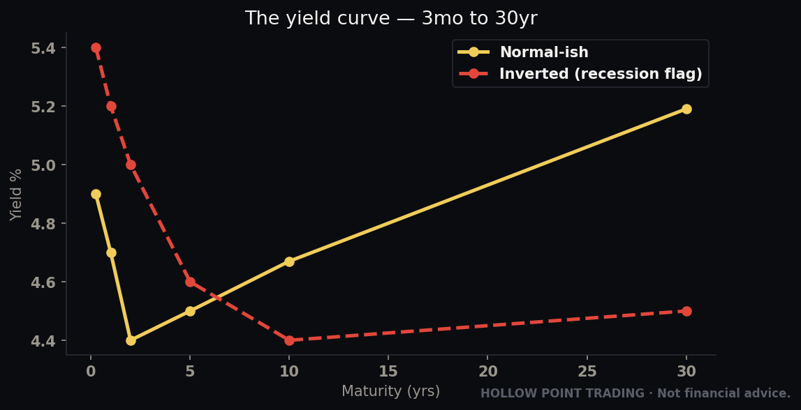
The yield curve is a plot of Treasury yields across every maturity — from 3-month bills out to the 30-year bond. Its shape is the single most-watched macro signal on the planet.
Normal (upward-sloping): Longer bonds pay more than shorter ones. This is healthy. Lending money for 10 years is riskier than for 2, so you demand more yield. A steep, upward curve says the economy is expected to grow.
Flat: Short and long yields converge. The market is undecided — often a late-cycle warning that growth expectations are cooling.
Inverted (downward-sloping): Short-term yields are higher than long-term yields. This is the alarm bell. It means the market expects the Federal Reserve — which controls short rates — to be forced to cut rates in the future, and rates get cut when the economy weakens. An inverted curve is the bond market betting on a slowdown or recession.
Why the shape means what it means
The short end of the curve (the 2-year and below) is essentially a bet on what the Fed will do over the next couple of years. The long end (10-year, 30-year) is a bet on long-run growth and inflation. So when short yields sit above long yields — inversion — the market is literally saying: "rates are high right now, but we're so confident the economy will weaken that we expect big cuts down the road, which drags the long end below the short end." An inverted curve is a forecast of future weakness expressed in today's prices.
A steep normal curve says the opposite: "money is cheap up front, but we expect growth and some inflation, so we demand a lot more to lend for ten years." That's the shape of an economy in expansion, and it's the friendliest backdrop for risk assets — especially cyclicals, financials, and small-caps that live and die on the growth cycle.
The 2s10s — Your One-Number Curve
You don't need the whole curve daily. You need one spread: the 2s10s, the 10-year yield minus the 2-year yield.
- 2s10s positive → normal curve, expansion mode.
- 2s10s near zero → flat, late cycle, pay attention.
- 2s10s negative → inverted, recession watch.
Here's the nuance that separates people who understand the curve from people who just quote it: inversion is not the sell signal. The un-inversion is.
The 2s10s has historically inverted 12–24 months before a recession. That's way too early to short stocks — markets often rip higher while the curve is inverted. The dangerous moment is when an inverted curve steepens back up through zero (the "bull steepener" driven by the front end collapsing as the Fed cuts in a panic). That re-steepening from inversion has been the far more timely recession-and-drawdown tell.
Bull steepener vs bear steepener — know the difference
A curve can steepen in two very different ways, and they mean opposite things. This is a distinction most retail never learns, and it's worth its weight in gold.
A bull steepener is when the curve steepens because the short end falls faster than the long end. The 2-year is collapsing — usually because the Fed is cutting or is expected to cut aggressively into weakness. This is the classic recession-arriving steepener. It's called "bull" because falling yields are technically bullish for bond prices, but for equities it's the ugly one: it means the Fed is panicking.
A bear steepener is when the curve steepens because the long end rises faster than the short end. The 30-year and 10-year are selling off hard while the front stays anchored. This says the market is worried about long-run inflation, ballooning government debt issuance, or a loss of fiscal credibility. Bear steepeners are historically rough for equity multiples because they lift the discount rate without any offsetting growth story.
So when you see the 2s10s steepening, don't stop there — ask which end is doing the work. Front end crashing = bull steepener = recession fear. Long end spiking = bear steepener = inflation/fiscal fear. Both are headwinds, but they call for different defenses.
Worked example
Suppose you're watching the 2s10s sitting at −0.50% (deeply inverted) for months while the S&P grinds higher. A rookie shorts on "inverted curve = recession" and bleeds for a year. The pro notes the inversion as context, keeps trading the trend, and only raises the defense flag when 2s10s rockets from −0.50% back toward 0 and then positive — especially if it's happening because the 2-year is crashing (the Fed is cutting). That's the tape saying the slowdown is arriving now, not someday.
Put numbers on it. Say over eight weeks the 2-year falls from 4.90% to 3.60% while the 10-year barely moves from 4.40% to 4.25%. The 2s10s just went from −0.50% to +0.65% — a 115-basis-point re-steepening driven almost entirely by the front end collapsing. That's a textbook bull steepener. The bond market is screaming that the Fed is about to be, or already is, cutting into weakness. Historically, that is the window where equity drawdowns cluster — not the quiet year of inversion that preceded it.
On TradingView, chart US10Y-US02Y and keep it on your macro watchlist. You're watching the level and the direction of change — and when it's moving, you're asking which end is driving it.
The 10Y and 30Y: Why the Long End Rules Stocks
Short rates (the 2-year) are mostly about the Fed. The long end — the 10-year and 30-year — is about growth, inflation expectations, and the price of long-term money. For equity traders, the 10-year yield is the most important number outside of the stock indices themselves.
Why the 10Y specifically? Because it's the discount rate for the future. A stock's value is its future cash flows discounted back to today at some rate — and that rate keys off the 10-year. This matters most for long-duration assets: high-growth tech, unprofitable names, anything whose value lives in cash flows five and ten years out. Discount a distant payoff at a higher rate and its present value shrinks fast.
That's why you'll see the pattern over and over: the 10-year yield spikes and the Nasdaq gets hit harder than the Dow. Growth/tech is long-duration and rate-sensitive; value, financials, and industrials are shorter-duration and sometimes benefit from higher rates (banks earn more on the spread).
Duration, in plain English
"Duration" sounds like jargon but the intuition is simple: it's how far in the future an asset's payoff lives. A profitable, dividend-paying utility gives you cash now and steady cash soon — short duration. A pre-profit software company promises enormous cash flows a decade out and nothing today — long duration. When the discount rate rises, the utility barely flinches, but the software company's value gets crushed, because you're discounting a distant promise at a steeper rate.
This is the single cleanest reason growth gets hammered on rate spikes while value shrugs. It's not sentiment or rotation for its own sake — it's arithmetic. A dollar promised in ten years is worth far less at a 5% discount rate than at a 3% one, and that dollar is most of a growth stock's valuation.
The 30-year and the message of the long bond
The 30-year ("the long bond") is the purest read on long-run inflation and fiscal credibility. When the 30Y is climbing hard while the Fed is cutting short rates, that's a bear steepener — the bond market saying "we don't believe inflation is dead" or "we're worried about government debt." Bear steepeners are historically rough for equity multiples.
The 30-year is also where the bond market registers its opinion of government borrowing. When a country issues a flood of long-dated debt, someone has to buy it, and buyers demand a higher yield to absorb the supply. A 30-year that keeps grinding higher even as growth data softens is often the market pricing a "fiscal premium" — and that's a headwind for equity valuations that has nothing to do with the earnings cycle.
Worked example
Tech is ripping, everyone's bullish, and you notice US10Y breaking above a multi-month range — say it clears 4.50% and accelerates toward 4.80% in a straight line. Even with no bad news on your stock, that is a headwind flashing. The rational move isn't to blindly short; it's to tighten into long tech, respect that the multiple is under pressure, and demand cleaner setups. The 10-year told you the weather changed before your stock's chart did.
Now make it concrete on your own book. You're long a basket of high-multiple software names. The 10-year has gone from 4.50% to 4.80% in nine trading days — 30 basis points, fast. None of your stocks have reported anything. But your trailing stops start getting tagged one by one, and the "reason" won't show up in any company headline. It's the discount rate. Knowing that, you don't fight it, you don't average down into it, and you don't invent a company-specific story. You recognize a macro tax and you respect it.
The rate of change matters more than the level
Stocks can adapt to 5% yields if they get there slowly. A fast move — 50–75 basis points in a couple weeks — is what breaks things, because it repriced the discount rate faster than earnings can adjust. Watch the slope of the 10Y, not just the number.
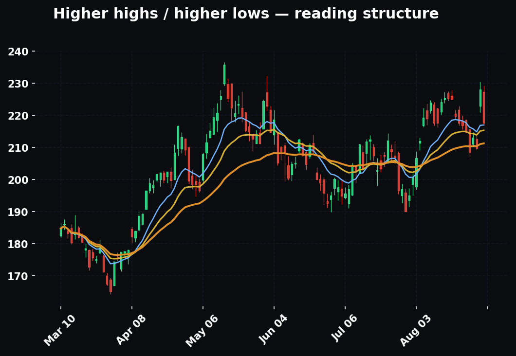
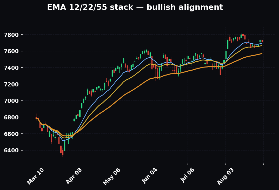
A useful practice: put a simple rate-of-change or a set of EMAs on the yield chart itself. When US10Y is above a rising 12/22/55 EMA stack and pulling away, that's the "fast and accelerating" regime that pressures multiples. When it's chopping sideways in a range, gravity is steady and stocks can trend on their own merits. The yield chart deserves the same structural read you'd give any equity chart.
Real vs Nominal Yields: The Distinction Pros Live By
Here's where most retail stops and pros keep going. The yield you see quoted — 4.5% on the 10-year — is the nominal yield. It has two pieces baked inside:
Nominal yield = real yield + inflation expectations.
The real yield is what's left after inflation — your actual purchasing-power return. You can watch it directly on TradingView via TIPS (Treasury Inflation-Protected Securities); the ETF ticker TIP and the real-yield series are your proxies.
Why this matters: *it's the real yield that fights risk assets, especially gold and growth stocks.
Two scenarios, same nominal yield of 4.5%:
- Inflation expectations are 3%, so the real yield is about 1.5%. Real money is cheap-ish. Gold and growth can breathe.
- Inflation expectations fall to 1.5%, so the real yield jumps to about 3%. Now holding cash/bonds gives you a real 3% return with no risk. That's a wrecking ball for gold (which pays nothing) and a serious headwind for speculative growth.
Same headline yield, opposite meaning. If you only watch the nominal number you'll be baffled when gold sells off "even though rates didn't move much" — the real yield moved because inflation expectations dropped.
How to actually watch this without a terminal
You don't need a professional data feed. Two practical proxies:
- TIP (the TIPS ETF) versus IEF (the plain 7–10 year Treasury ETF). When TIP is outperforming IEF, inflation expectations are rising relative to real yields — an inflationary tilt. When TIP is underperforming, real yields are doing the work — a disinflationary, real-rate-driven tightening.
- The breakeven concept: the gap between the nominal 10-year and the 10-year TIPS yield is the market's inflation expectation. If nominal is 4.5% and the real (TIPS) yield is 2.0%, the market expects roughly 2.5% inflation. Watch whether that gap is widening (inflation fear building) or narrowing (disinflation).
Even a rough read — "real yields are the driver this week, not inflation expectations" — completely changes how you interpret gold and growth. That's the payoff for going one layer deeper than the headline number.
The gold tell
Gold has a strong inverse relationship with real yields. Rising real yields = falling gold, most of the time. The logic: gold pays no interest and stores no cash flow. Its entire competition is "risk-free real return." When you can earn a guaranteed 3% real return in TIPS, holding a shiny rock that yields nothing looks expensive, so gold falls. When the real return on cash drops toward zero or negative, the opportunity cost of holding gold vanishes and it can run.
When that relationship breaks — gold rising with rising real yields — something structural is happening (central-bank buying, a currency-debasement bid, a geopolitical fear premium). A broken correlation is information; note it, don't ignore it. In fact, some of the most important macro regime changes announce themselves precisely as a broken correlation — the old rule stops working, and that's the tell that a new driver has taken over.
The Dollar (DXY): The Global Liquidity Valve
The DXY is the U.S. dollar measured against a basket of major currencies (heavily the euro, plus yen, pound, and others). Because the dollar is the world's reserve currency and the denominator of global trade and debt, it acts as a master risk valve.
The default relationship: strong dollar = tighter global conditions = headwind for risk assets. Weak dollar = looser conditions = tailwind for risk.
Several mechanisms drive this:
- Commodities are priced in dollars. A stronger dollar makes oil, copper, and gold more expensive for the rest of the world, which pressures commodity prices and commodity-linked economies.
- Dollar-denominated debt. Emerging markets and corporations borrow in dollars. A rising dollar makes their debt more expensive to service — a global tightening that hits EM equities and high-yield credit first.
- Earnings translation. A strong dollar shrinks the overseas earnings of U.S. multinationals when translated back home — a direct drag on S&P 500 earnings.
- Safe-haven flows. In genuine panic, money runs into the dollar. So a sharply rising DXY during a selloff is confirmation of real fear, not just noise.
The dollar as the world's margin call
Here's the intuition that makes the dollar click. There are trillions of dollars of debt owed by non-Americans — companies and governments that earn in their local currency but owe in dollars. When the dollar rises, their debt gets heavier in real terms even though the loan amount never changed. To service it, they have to buy dollars, which pushes the dollar higher still, which makes the debt heavier still. A rising dollar can become a self-reinforcing global tightening — effectively a margin call on the entire non-U.S. financial system. That's why a fast, sustained dollar rip is one of the most dangerous things in markets, and why it hits the most fragile links — emerging markets and junk credit — first.
Worked example
The S&P is chopping sideways and you can't tell which way it breaks. You pull up DXY. It's been rolling over — lower highs, breaking its 55-EMA to the downside, momentum bleeding. That falling dollar is a quiet tailwind; it tilts the odds toward the equity break resolving up. Now flip it: DXY is ripping to new highs on safe-haven demand while stocks wobble. That's the machine warning you the wobble has teeth. The dollar didn't tell you the exact level — it told you which way to lean.
Take it further. It's a Wednesday, SPY has coiled into a tight three-day range, and you're waiting for the break. You check DXY: it just failed at its 55-EMA for the third time and is breaking below a two-week shelf. Separately, HYG is firm at its highs. Two of your macro dials — dollar soft, credit firm — are both tilting risk-on. When SPY breaks, you already know which direction has the wind behind it, and you can be more aggressive on the long side and quicker to fade a downside fakeout. The macro didn't call the level; it stacked the odds.
Don't over-mechanize it
The dollar–stock correlation isn't a law of physics; it strengthens and weakens across regimes. In some periods "good news" strengthens the dollar and stocks together (strong U.S. growth pulling capital into both). Use DXY as a weight on the scale, confirmed by the other markets — never as a standalone trigger. The times it decouples from stocks are themselves informative: a dollar that's rising with stocks on strong growth data feels very different from a dollar rising against stocks on safe-haven fear. Same DXY direction, opposite meaning — which is exactly why you never read one dial alone.
Credit Spreads: The Market's Lie Detector
If you learn one advanced tool from this entire guide, make it credit spreads. Credit is where stress shows up first, because bond investors are structurally more paranoid than stock investors. A stockholder dreams about upside; a bondholder just wants to be paid back. That paranoia makes credit an early-warning system.
The tools, both liquid ETFs you can chart on TradingView:
- HYG — high-yield ("junk") corporate bonds. Riskier companies, higher yield.
- LQD — investment-grade corporate bonds. Safer, blue-chip issuers.
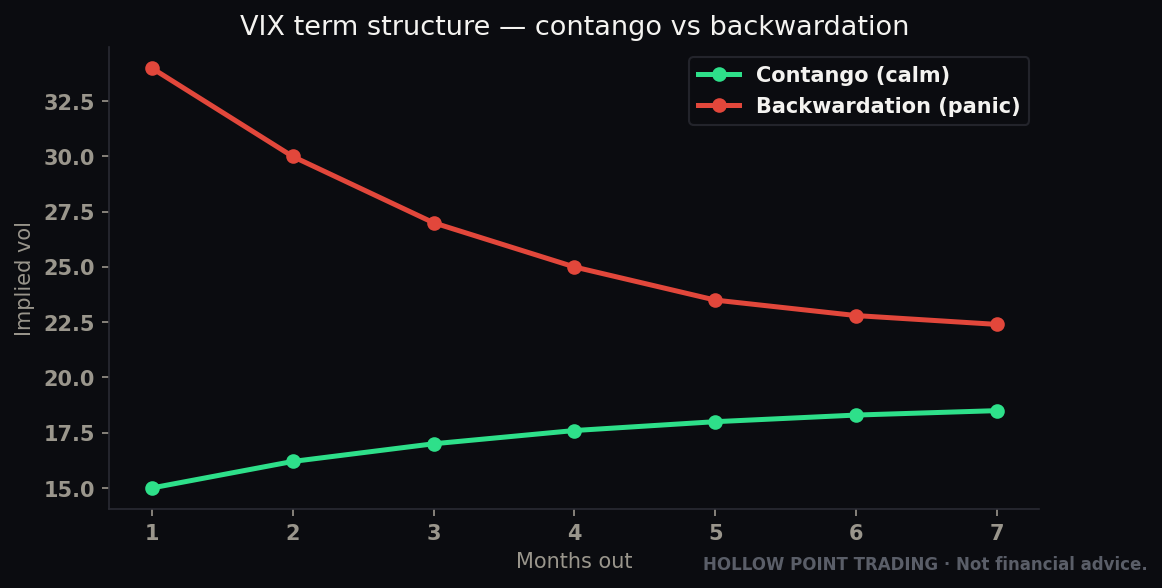
A credit spread is the extra yield investors demand to hold risky corporate debt over safe Treasuries. When investors are calm, they'll hold junk for only a little extra yield — spreads are tight. When they get scared, they demand a lot more to hold junk, or they dump it entirely — spreads widen. Widening spreads = rising fear = risk-off. It's that simple and that powerful.
Why bondholders see the crack first
Think about the asymmetry. If you own a company's stock and the business does great, you can make ten times your money. If you own that same company's bond and the business does great, you get... exactly the interest you were promised. No more. The bondholder's upside is capped, but the downside — if the company defaults — is a total loss. So bond investors are paid to be paranoid. They obsess over the balance sheet, the debt maturities, the cash flow coverage. When a company's fundamentals start to deteriorate, the bond desk smells it before the stock crowd, because the bond desk is looking at exactly the thing that breaks first. Credit spreads are the aggregate of thousands of these paranoid, well-informed opinions.
You can watch this three ways
- HYG's price directly. HYG falling, especially breaking support, is stress. HYG making new highs with equities is confirmation of a healthy risk appetite.
- HYG relative to LQD (`HYG/LQD` ratio). When junk is outperforming investment grade, risk appetite is strong (risk-on). When junk underperforms — the ratio rolling over — money is fleeing risk within the bond market. That's an early risk-off tell.
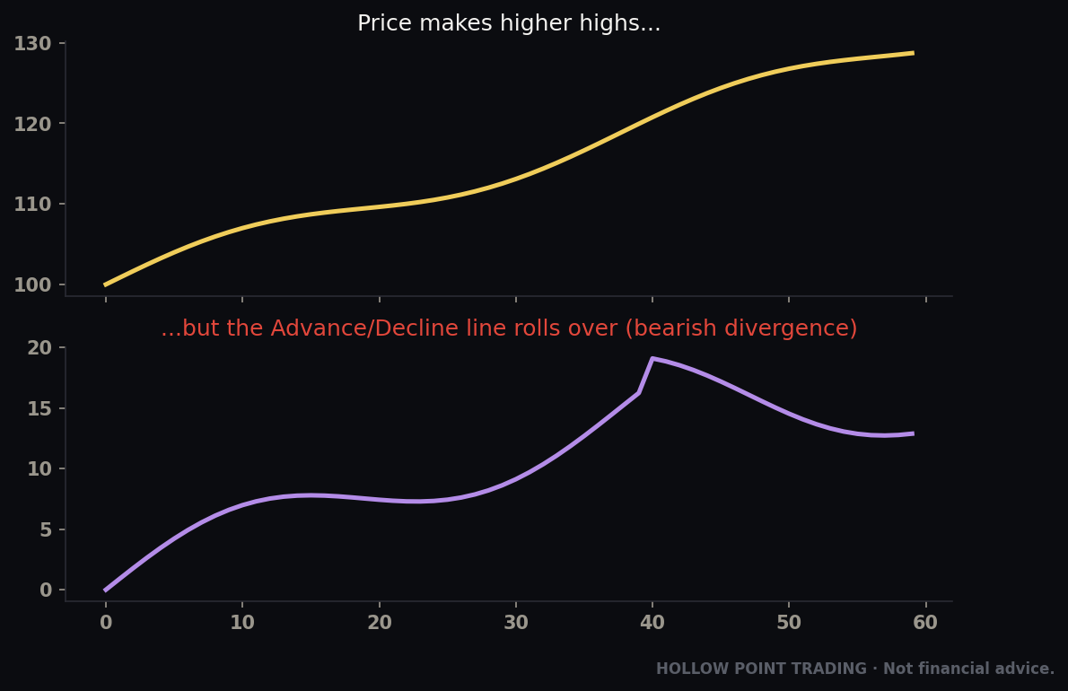
- HYG vs SPY divergence. This is the classic. When stocks make a new high but HYG fails to confirm — equities up, junk bonds not following — the smart money in credit isn't buying the rally. That non-confirmation has preceded plenty of equity tops.
Worked example
SPY prints a fresh all-time high on a Tuesday. Looks bulletproof. But you pull up HYG and it topped a week ago and is drifting lower; the HYG/LQD ratio is rolling over. That divergence is the bond market quietly de-risking while the equity crowd celebrates. It's not a short trigger by itself — but it's a giant caution flag that says "this new high is on thin ice; tighten stops, size down, don't chase." Credit called the risk before the S&P chart showed a single crack.
The reverse is just as useful: in a scary selloff, if HYG stops going down and starts holding while stocks are still puking, credit is telling you the fear is exhausting. Bottoms in credit often lead bottoms in equities. Picture a capitulation day — SPY gaps down and grinds lower all morning — but HYG gapped down, held its opening low, and is quietly grinding green while stocks bleed. The bond market is done selling. That positive divergence has marked the low of countless equity flushes, and it's invisible to anyone staring only at the SPY chart.
A note on the mechanics of these ETFs
One honest caveat: HYG and LQD are ETFs, so they carry a little interest-rate sensitivity of their own (they're bonds, after all) and they can wobble around dividend dates. Don't obsess over a single day's tick. The signal is in the trend and the divergence over days and weeks, not one candle. Use the HYG/LQD ratio when you want to strip out some of the pure-rates noise and isolate the risk-appetite signal, since both legs share rate sensitivity and the ratio largely cancels it.
Gold and Oil: The Growth and Inflation Read
Commodities complete the machine. Two matter most.
Gold is your read on real yields, currency debasement, and fear. Its main driver is inverse real yields (covered above). Its secondary driver is the dollar (inverse) and fear (safe-haven bid). When gold is breaking out to new highs while real yields aren't rising and the dollar isn't collapsing, that's often the "debasement trade" — investors hedging against fiscal irresponsibility and monetary excess. Rising gold in that context is a subtle vote of no-confidence in paper money, and it frequently runs alongside strong risk assets, not against them.
Reading gold's "why," not just its direction
Gold going up is not one signal — it's three possible signals wearing the same coat, and your job is to figure out which one:
- Gold up + real yields down → the classic monetary read. Falling opportunity cost. Usually happens when the Fed is easing or growth is slowing. Often risk-on for growth stocks too.
- Gold up + dollar down → the currency read. The dollar is losing value, so gold priced in dollars mechanically rises.
- Gold up + real yields up + dollar up → the broken correlation. When gold rallies against all its normal headwinds at once, that's the debasement/geopolitical/central-bank-buying bid. This is the rarest and most important version, because it means a structural buyer is in the market who doesn't care about the usual math. When you see it, respect it — it often marks a regime where the old macro rulebook is being rewritten.
Oil, the real-time growth-and-inflation dial
Oil (WTI, USOIL / CL) is your read on real-time growth and inflation. Rising oil on demand (a growing economy) is a growth signal — often bullish for cyclicals and energy. But rising oil that becomes a cost shock is a tax on consumers and a driver of the inflation that forces the Fed to stay tight — which loops right back into higher yields and pressure on stocks. Oil is the input that can turn the whole rates story hawkish.
The tell for which kind of oil move you're looking at is the rest of the machine. Oil rising alongside copper, industrials, and a steepening growth curve is demand-pull — the good kind, a growth signal. Oil spiking on a supply headline (a pipeline, a conflict, an OPEC cut) while growth-sensitive assets fall is a cost shock — the bad kind, a tax that feeds straight into the inflation-and-rates loop. Same oil chart, opposite implication, and the context tells you which.
The intermarket loop, made concrete
Oil spikes → inflation expectations rise → the 10-year yield climbs → the discount rate on long-duration tech rises → the Nasdaq gets pressured → if the move is violent enough, credit spreads widen → risk-off spreads across everything. One commodity can pull the whole chain. Seeing the first link (oil breaking out) lets you anticipate the last one (equity pressure).
Trace it with numbers. USOIL breaks out of a base and runs from $72 to $88 over three weeks on a supply scare. Watch the chain light up: the 10-year breakeven (inflation expectation) ticks up, US10Y climbs from 4.20% to 4.55%, the Nasdaq — the most rate-sensitive index — starts underperforming the Dow, and if it keeps going, HYG begins to soften. You saw the first domino (oil) and you knew where the last one (equity pressure, especially in tech) was likely to fall. That's the entire point of reading the machine instead of a single chart.
How Bonds Lead Equities
The recurring theme: the bond and credit markets are usually earlier than the stock market. Bond desks are bigger, more macro-driven, and more focused on capital preservation, so they reprice risk before the equity crowd. Practically, that means:
- The 2s10s re-steepening through zero leads recession-driven equity drawdowns.
- A fast rise in the 10Y leads pressure on growth multiples.
- Credit spreads widening (HYG rolling over) leads equity tops.
- Credit stabilizing leads equity bottoms.
- A DXY safe-haven spike confirms that an equity wobble is real.
You won't always get a clean lead, and sometimes stocks and bonds move together. But when they diverge, the bond market's message is the one to respect. Equities are the loud, emotional part of the machine. Bonds and credit are the quiet, smart part. When the quiet part disagrees with the loud part, lean toward quiet.
Why "earlier" doesn't mean "precise"
An honest word of caution: leading indicators lead by variable amounts. Credit can diverge for a week before a top or for two months. The 2s10s can re-steepen and stocks can still grind higher for a quarter before the drawdown. So these are not entry triggers — they're posture signals. They tell you when to shift from aggressive to defensive, from chasing to demanding, from full size to half size. The mistake is treating an early warning like a stopwatch. It's a weather forecast, not a train schedule. You dress for the storm; you don't stand on the platform expecting it at 9:02 sharp.
Different Market Regimes Change Every Rule
Every relationship in this guide behaves differently depending on the regime the market is in. This is the layer that separates a mechanical rule-follower from someone who actually reads the machine. There are three broad regimes worth knowing.
Trending risk-on
Yields are stable or gently falling, the dollar is soft or range-bound, credit is firm and confirming new highs, real yields are contained. In this regime the correlations are reliable and boring: dips get bought, growth leads, breadth is healthy, and the macro dials mostly nod along in agreement. Your job is easy — the machine is confirming, so you can lean into your equity setups with size, trade the trend, and treat the occasional macro wobble as noise until proven otherwise. The danger here is complacency: you get so used to the dials agreeing that you stop checking them, and you're unprepared the day one of them breaks.
Chop / transition
The dials disagree. Dollar up but credit still firm; yields rising but gold not falling; SPY at highs but HYG diverging. This is the regime where correlations get noisy and unreliable, and it's where most macro-based overtrading happens. The right posture in chop is smaller and pickier. When the machine can't agree with itself, the honest read is "no strong macro bias," and you should demand cleaner, higher-confluence stock setups and cut size. Trying to force a directional macro thesis out of a market whose own dials contradict each other is a fast way to churn your account. Sometimes the correct macro read is "mixed — no edge from the top layer today," and saying so is a skill, not a failure.
High-volatility / risk-off
Now the correlations intensify and everything moves together. In a genuine risk-off event — a credit shock, a growth scare, a geopolitical panic — correlations go to one. Stocks fall, the dollar rips as a haven, credit spreads blow out, the front end of the curve collapses as the market prices Fed cuts, and gold's behavior tells you whether it's a liquidation (gold sold for cash) or a fear bid (gold up). In this regime the macro layer is dominant — a beautiful single-stock setup means almost nothing when the whole machine has flipped and correlations have locked to one. The right posture is defensive by default: smaller size, wider awareness, and a bias toward respecting the tape over any individual chart. The flip side is that these regimes also produce the cleanest bottoming tells — credit stabilizing, the dollar rolling over from a haven spike, gold calming — because when correlations are tight, their reversal is a high-signal event.
The practical takeaway
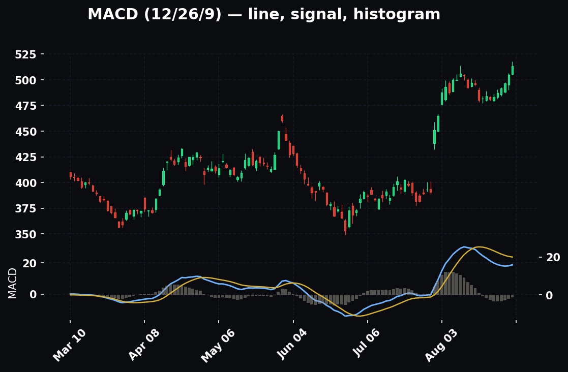
Before you interpret any single dial, ask which regime am I in? The same DXY spike means "minor headwind" in a trending risk-on tape and "get defensive now" in a high-vol tape. The same HYG divergence is noise in chop and a serious warning near the end of a long trend. Regime first, dial second.
Multi-Timeframe Intermarket Analysis
Intermarket signals live on different timeframes, and mixing them up is a classic error. Match the timeframe of your macro read to the timeframe of your trade.
The macro / structural timeframe (weekly, daily)
The big regime signals — the yield curve shape, the multi-month trend in the 10-year, the dollar's position relative to its weekly 55-EMA, the structural direction of credit — live on the daily and weekly charts. These set your strategic bias: risk-on or risk-off as a stance for the coming days and weeks. This is the timeframe that answers "should I be leaning long or defensive in general right now?" A daily-chart bear steepener isn't going to help you time a 5-minute scalp, but it tells you which side of the boat to favor for weeks.
The tactical timeframe (hourly, 15-minute)
For a swing or day trade, drop the same charts to the hourly and 15-minute. Is US10Y spiking this morning? Is DXY breaking its overnight range? Is HYG diverging intraday from SPY? These tactical reads tell you whether today's wind agrees with your structural bias. The highest-confluence trades are when the two align: a daily risk-on backdrop and an intraday tape where the dollar is soft and credit is firm.
When timeframes conflict
The interesting cases are conflicts. A daily risk-off backdrop (curve re-steepening, credit deteriorating) but an intraday risk-on bounce (dollar pulling back, oversold snap). That conflict tells you the bounce is likely tactical and fadeable, not the start of a new trend — so you trade it small, take profits quickly, and don't marry it. Conversely, a daily risk-on backdrop with an intraday scare is usually a dip to buy, not a top. The structural timeframe sets the default; the tactical timeframe times the entry; and when they disagree, you trust structure for bias and tactics for timing, sizing down until they realign.
How It Combines With Your Other Tools — Confluence
Intermarket analysis is powerful, but it's a bias-and-sizing tool, not an entry trigger. It earns its keep when you stack it with the tools you already run. Three combinations matter most inside the HPT process.
Confluence with the EMA 12/22/55 trend framework
Your EMA stack tells you the trend and health of the individual stock. Intermarket tells you the health of the environment. The A+ trade is when they agree: a stock in a clean uptrend, price above a rising 12/22/55 stack, pulling back to the 22-EMA for a long entry — and a macro backdrop with a soft dollar, firm credit, and stable yields. Now the wind, the trend, and the entry all point the same way. When they disagree — a perfect EMA pullback long but the 10-year is spiking and HYG is breaking — you either pass or take half size, because you're fighting the environment even though the stock chart looks clean. The EMA framework gets you the entry; intermarket decides how hard you press it.
Confluence with multi-timeframe structure
Layer the intermarket regime onto your timeframe-weighted confluence. If your daily, hourly, and 15-minute structure all point long and the macro machine is risk-on, that's a full-conviction, full-size trade. If your timeframes are mixed and the macro dials disagree, that's a no-trade or a scalp at best. Intermarket adds a whole extra timeframe — the macro one — to the top of your confluence stack. It's the tiebreaker when your price-based timeframes are split.
Confluence with volume and relative strength
Two more overlays sharpen the read. First, relative strength: in a risk-on macro backdrop, hunt for the names leading their sector and their index — that's where the environment's tailwind concentrates. In risk-off, watch what refuses to fall (relative strength in a weak tape is a coiled spring for the eventual bounce). Second, volume: a macro-confirmed breakout on strong volume is far more trustworthy than the same breakout on thin volume with the dollar quietly ripping against it. When intermarket, relative strength, and volume all point the same way behind a clean technical setup, you have the kind of stacked confluence that justifies your largest size — while still honoring the 1:3 and the hard invalidation.
How It Fits the HPT Top-Down Process
Intermarket analysis isn't a separate hobby — it is the macro layer of the funnel. Here's the sequence, HPT style.
Step 1 — Macro (this guide). Before you look at a single stock, take the machine's temperature with five charts:
US10Y— level and rate of change. Rising fast = headwind.US10Y-US02Y(2s10s) — curve shape and direction.DXY— up or down, relative to its 12/22/55 EMAs.HYG(andHYG/LQD) — confirming or diverging from equities.GOLDandUSOIL— inflation/growth read.
From these you get one word: risk-on or risk-off. That's your bias for the day.
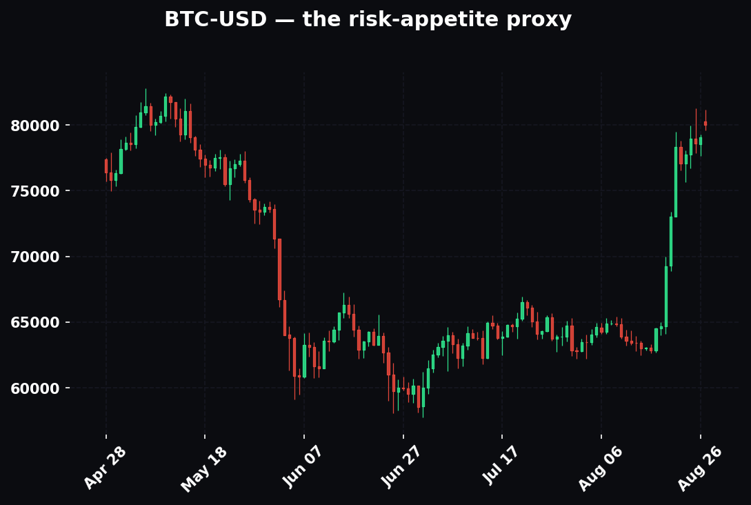
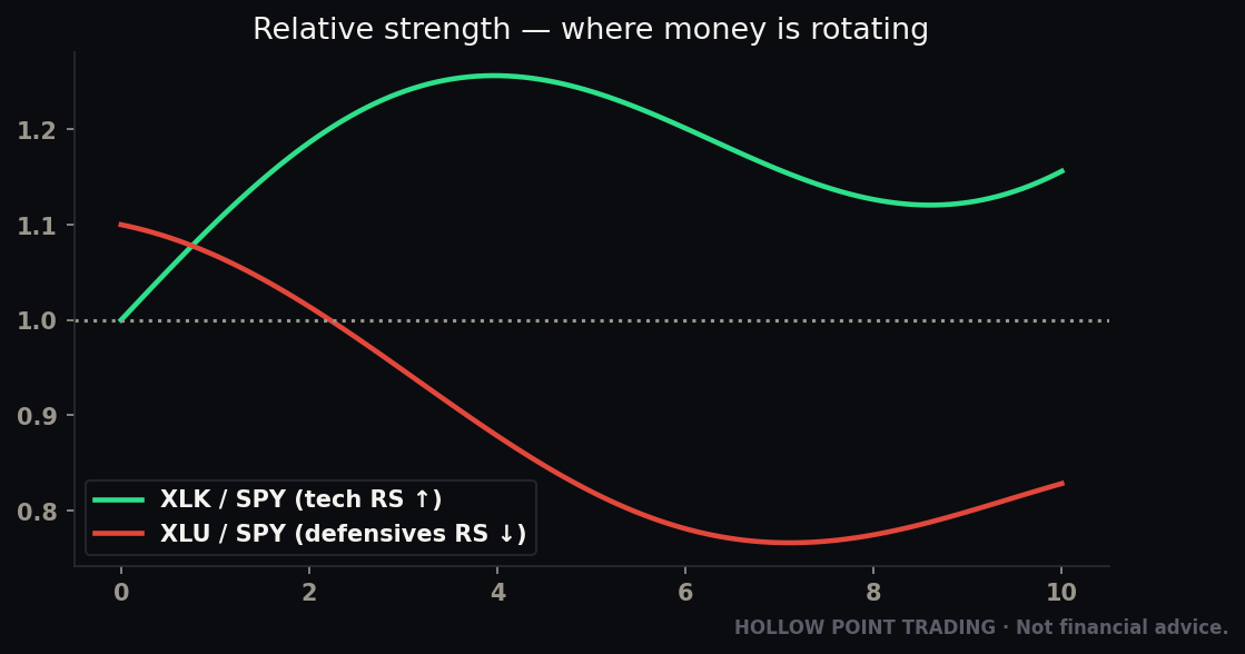
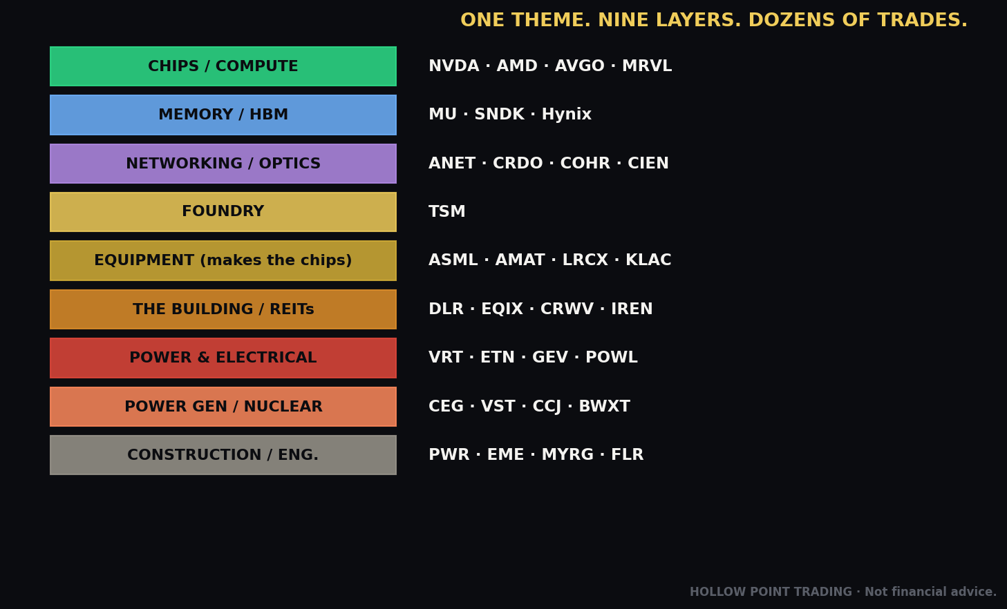
Step 2 — Sector. Your macro read selects your sectors. Rising yields → favor financials/energy/value over long-duration tech. Falling dollar + tight credit + falling real yields → growth and small-caps get the tailwind. Risk-off → defensives (utilities, staples). The macro machine tells you which aisle of the store to shop in.
Step 3 — Stock & timeframe-weighted confluence. Now you drop to the individual name with your EMA 12/22/55 trend framework and your multi-timeframe confluence. The intermarket read is a weight on the scale: a clean long setup in a strong stock, in a favored sector, with a falling dollar and tight credit behind it, is a high-confluence trade. That same setup with the 10Y spiking and HYG breaking down is a trade you either pass or size down hard.
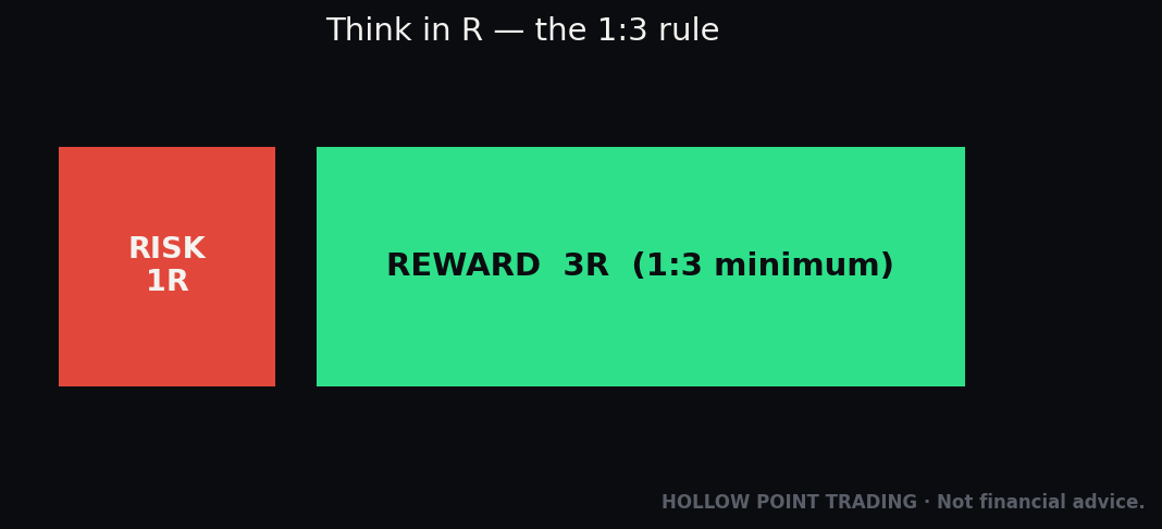
Step 4 — Risk (1:3, discipline over prediction). Intermarket analysis improves your bias and your sizing, not your entry mechanics. You still need the 1:3 R/R, the defined invalidation, the discipline. The machine tells you whether the wind is at your back; your rules still get you in and out.
A full walk-through, start to finish
Monday, pre-market. You run the five macro charts in ninety seconds. US10Y: 4.25%, flat for two weeks, sitting on a range — steady gravity. US10Y-US02Y: +0.35% and holding — normal curve, no recession flag. DXY: rolling over, just lost its 55-EMA — a soft-dollar tailwind. HYG: firm, near highs, confirming — healthy credit. GOLD: quietly climbing; USOIL: range-bound, no cost-shock. Verdict in one word: risk-on. Bias for the day: favor longs, favor growth.
Step two, sector: soft dollar plus firm credit plus contained yields tilts you toward growth and small-caps. You shop the tech and semis aisle.
Step three, stock: you find a semiconductor leader in a clean daily uptrend, above a rising 12/22/55 stack, pulling back to its 22-EMA on the hourly with a relative-strength edge over the SOX. All four align — macro, sector, trend, timeframe.
Step four, risk: entry off the 22-EMA reclaim, stop below the pullback low, target at a 1:3 minimum. Because the machine is at your back and the confluence is stacked, this is a full-size expression. Contrast the exact same stock setup on a morning when the 10-year is spiking 20 bps and HYG is breaking support — identical chart, but now you pass or take a quarter size, because the wind flipped. Same stock, opposite decision, and only the macro layer told you why.
How the Pros Use This Differently From Beginners
The tools in this guide are public. What separates the desk that moves size from the retail trader running the same five charts isn't access — it's interpretation. Here's where the gap actually lives.
Beginners read levels; pros read the rate of change. A beginner sees "10-year at 4.5%" and files it. A pro sees "10-year up 30 bps in two weeks and accelerating" and knows the multiple compression is happening now. The number is nearly useless; the slope is everything.
Beginners want a trigger; pros want a posture. Retail asks "does inverted curve mean short?" Pros never expect a single dial to fire an entry. They accumulate the dials into a stance — lean long, lean defensive, stand aside — and let their actual entry tools pull the trigger. Intermarket sizes the bet; it doesn't place it.
Beginners treat correlations as laws; pros treat them as regime-dependent tendencies that are most valuable when they break. The pro's ears perk up precisely when gold rallies with rising real yields, or when the dollar and stocks rise together. The broken correlation is the high-value signal, because it announces a regime change. Beginners get confused by breaks; pros get paid by them.
Beginners watch the loud market; pros watch the quiet one. Retail stares at SPY. The desk stares at HYG, the 2-year, the front end of the curve — the quiet, smart markets that reprice first. When the quiet market disagrees with the loud one, the pro trusts quiet.
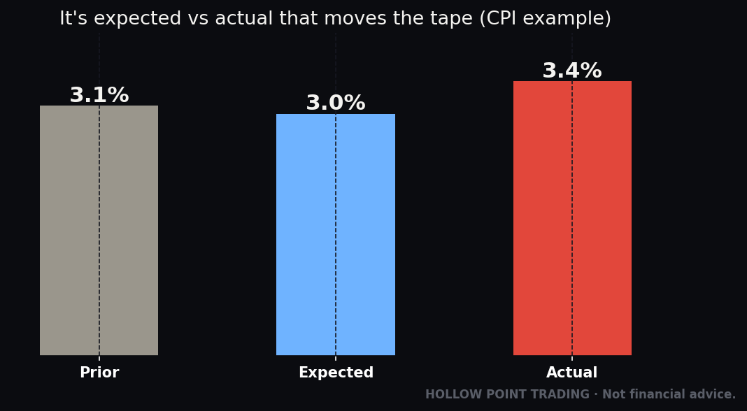
Beginners react to news; pros read the machine that news moves through. A CPI print isn't a signal by itself to a pro — it's an input they watch cascade through breakevens, into the 10-year, into the discount rate, into tech. They're positioned around the reaction chain, not the headline.
Beginners run one timeframe; pros align three. The desk knows the daily regime, the intraday tape, and where they conflict — and they size accordingly, biggest when all three agree, smallest when they fight.
The Common Mistakes
1. Treating correlations as constant laws. Every relationship here — dollar vs stocks, gold vs real yields, bonds vs equities — is regime-dependent. It holds most of the time, breaks some of the time, and the breaks are information. Never build a trade on "DXY up so stocks must go down" as if it's gravity. It's a tendency, weighted into a broader read.
2. Confusing the level with the rate of change. Stocks don't fear a 5% ten-year; they fear a 10-year that went from 4% to 5% in three weeks. Speed repriced the discount rate faster than fundamentals could adjust. Always read the slope, not just the number.
3. Shorting stocks the day the curve inverts. Inversion leads recessions by a year or more. The un-inversion is the timely tell. People who shorted on inversion alone got run over for months. Worse, they burned capital and conviction fighting a trend that had a year left to run.
4. Watching nominal yields and ignoring real yields. You'll misread gold and growth every time. When something "shouldn't" be moving, check the real yield and inflation expectations — that's usually the hidden driver. The nominal number is the surface; the real yield is the current underneath it.
5. Ignoring credit until it's obvious. By the time HYG has crashed and it's in the headlines, the move is half over. The edge is in the quiet divergence — HYG rolling over while SPY makes a new high. That's the whisper, not the scream. Waiting for the scream is waiting for everyone else to have already acted.
6. Analysis paralysis. Five macro charts, not fifty. You're taking a temperature and getting one word — risk-on or risk-off — plus a sector tilt. If you can't state your macro read in two sentences, you're overcooking it. More inputs past a point reduce clarity; they don't add it.
7. Forgetting the machine can override your beautiful setup. A textbook chart pattern in a single stock means little if the whole machine flipped risk-off that morning. Macro is the tide; your stock is a boat. Respect the tide. The prettiest chart in a hostile environment is a value trap for your capital.
8. Forcing a macro thesis in chop. When the dials disagree, the honest read is "no strong bias." Beginners hate that answer and manufacture a directional story anyway, then overtrade a market with no macro edge. "Mixed, stand down" is a legitimate and profitable conclusion.
9. Using a daily macro signal to time an intraday trade (and vice versa). A weekly bear steepener won't help you time a 15-minute entry, and an intraday dollar wiggle shouldn't change your multi-week bias. Match the timeframe of the signal to the timeframe of the trade.
10. Reading one dial in isolation. DXY up means one thing with credit firm and another with credit breaking. Gold up means three different things depending on real yields and the dollar. The machine only speaks when you read the dials together. A single dial is a rumor; the confluence is the story.
11. Expecting the lead to be precise. These are leading tendencies, not stopwatches. Credit can diverge for a week or two months before a top. Treat the warnings as posture shifts, not countdowns, and you won't get frustrated into abandoning a correct read too early.
12. Never noticing when a correlation breaks. The single highest-value event in intermarket analysis is a reliable relationship failing — gold up with real yields, dollar up with stocks. Beginners get confused and ignore it. That break is the market telling you the regime changed. Write it down; it's often the most important thing on the screen that day.
Frequently Asked Questions
Do I really need to watch all five charts every day? Yes, but it takes ninety seconds once it's a habit. You're not analyzing them deeply — you're taking a temperature. Level and direction of the 10-year, shape and direction of the 2s10s, dollar relative to its EMAs, credit firm or diverging, gold and oil for the inflation/growth tilt. One pass, one word: risk-on or risk-off. The whole point is that it's fast enough to do before you touch a single stock.
What if the dials disagree with each other? That's a legitimate and common outcome, and the honest read is "mixed — no strong macro bias today." That should push you toward smaller size and pickier setups, not toward inventing a directional story. Some of your best risk management comes from recognizing a no-edge macro tape and simply demanding more from your stock setups.
Isn't this just for long-term investors? I day-trade. No. The timeframes scale. A day trader runs the same five charts on the hourly and 15-minute to read today's wind — is the 10-year spiking this morning, is the dollar breaking its overnight range, is credit diverging intraday. The instruments are the same; you just drop the resolution to match your holding period.
Which single indicator matters most if I can only watch one? For equity traders, the 10-year yield — it's the discount rate for the entire market and it hits the most-traded names (tech) hardest. But if you can watch two, add credit (HYG), because credit leads and the 10-year plus credit together cover both the valuation channel and the fear channel.
Do these relationships work on individual stocks or just indices? They work most cleanly on indices and sectors, because that's the level the macro forces operate on. On an individual stock, the macro is one input among several; a strong company can rally in a risk-off tape and a weak one can fall in a risk-on tape. Use intermarket to set your bias and sector tilt, then let the individual stock's own structure and relative strength do the fine work.
How do I know if a correlation has "broken" versus just wobbled for a day? One day is noise. A break is a sustained divergence over a week or more against the normal relationship — gold climbing for two weeks while real yields also climb, for instance. If it holds for several days and across timeframes, treat it as a regime signal and adjust. If it's back to normal tomorrow, it was noise.
Where do stocks and bonds move together instead of opposite? In strong-growth, non-inflationary regimes, "good news" can lift both — yields rise on growth optimism and stocks rise on the same optimism. The dollar-stock and yield-stock relationships are tendencies, not laws, and they're most reliable in inflation-driven or fear-driven tapes. This is exactly why you read the whole machine rather than a single pair.
The Cheat-Sheet
Print this. Run it before the open.
The five macro charts (TradingView tickers):
US10Y— the discount rate. Rising fast = risk headwind, worst for tech.US10Y-US02Y— 2s10s. Positive = normal. Negative = inverted (recession watch, but early). Re-steepening through zero = timely defense flag. Ask which end is driving it (front crashing = bull steepener = recession fear; long end spiking = bear steepener = inflation/fiscal fear).DXY— dollar. Up (esp. safe-haven spike) = risk-off. Down = risk-on tailwind. Read relative to 12/22/55 EMAs.HYG+HYG/LQD— credit. Falling/diverging from SPY = stress leading equities. Confirming = healthy. Use the ratio to strip out rate noise.GOLD+USOIL— gold inverse to real yields (fear/debasement); oil = growth-vs-cost-shock read.
The core relationships:
- Bond price ↑ = yield ↓ (opposite, always).
- Rates ↑ → discount rate ↑ → long-duration tech ↓ (Nasdaq > Dow pain).
- Nominal = real + inflation expectations. Real yields fight gold and growth.
- Strong dollar = global tightening = risk headwind (the world's margin call).
- Widening credit spreads (HYG down) = fear rising = risk-off, and it leads stocks.
- Rising real yields = falling gold (until the correlation breaks — then pay attention).
- Oil spike → yields up → tech down → possible risk-off cascade.
The reads that lead equities:
- 2s10s re-steepening through zero → recession/drawdown watch.
- Fast 10Y spike → growth-multiple pressure.
- HYG diverging below a new SPY high → equity top warning.
- HYG stabilizing in a selloff → equity bottom forming.
- DXY safe-haven spike in a wobble → the wobble is real.
Regime overlay (read this first):
- Trending risk-on → dials agree and are boring → lean in, full size, buy dips.
- Chop / transition → dials disagree → smaller, pickier, "no strong bias" is a valid call.
- High-vol / risk-off → correlations go to one → defensive default, and watch for the reversal of the tight correlations as the bottoming tell.
Timeframe rule: Daily/weekly = strategic bias. Hourly/15-min = tactical timing. When they conflict, trust structure for bias, tactics for timing, and size down until they realign.
The one-line macro verdict: Yields calm or falling + dollar soft + credit tight (HYG firm) + real yields down = risk-on, favor growth. Yields spiking + dollar bid + credit widening (HYG breaking) = risk-off, defense and value, size down.
The Bottom Line
The market isn't one chart. It's a machine — rates, the dollar, credit, and commodities all pricing the same thing (risk) from different angles, constantly. The equity index is just the loudest, most emotional readout of that machine. The bond and credit markets are the quiet, smart ones, and they usually speak first.
You don't need an economics degree. You need five charts, one clear question — is the wind at my back or in my face? — and the discipline to let the answer tilt your trades rather than override your rules. Run the regime read first, then the dials, then match the timeframe to your trade, then stack it as confluence on top of your EMA framework and your structure. Do this before you look at a single stock and you'll stop getting blindsided by moves that "came out of nowhere." They never come out of nowhere. They come out of the plumbing — and now you know how to read it.
Bound by rules, feared by trade.